
こんにちは。今回はモーダルウィンドウの作り方を徹底的に解説していきます。
この記事は僕が書いている5歳でも分かるシリーズの1つです。こちらにスライドショーやタブメニューなどの作り方も載っていますのでぜひご覧ください。
「htmlはデータの構造」「cssはその見せ方を作るもの」「jsはクラスの付け替えによってその2つを操作するもの」と言う切り分け方を前提に、jQueryのaddClass/removeClass/toggleClassを用いた方法で実装します。
10/02追記
本シリーズはjQueryで解説をしておりますが、今後は基本的にVanilla JSなど別の方法で実装した方がベターかと思われます。→参考:https://itokoba.com/archives/4765
10/4追記
jQueryからVanilla JSに移行する際の手助けになるような情報をまとめた本をzennさんで出しました。ぜひお買い求めください。

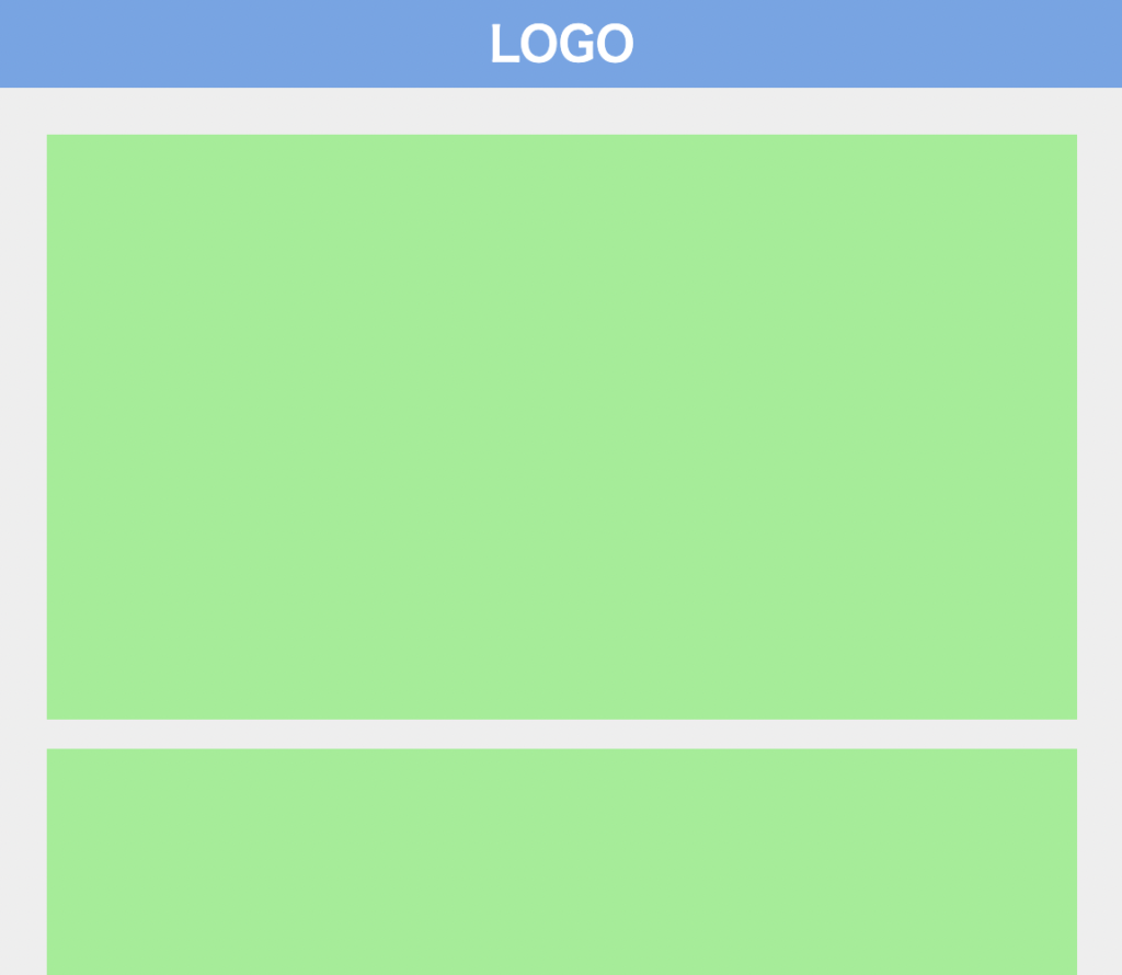
作るものの確認
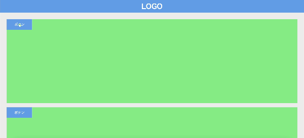
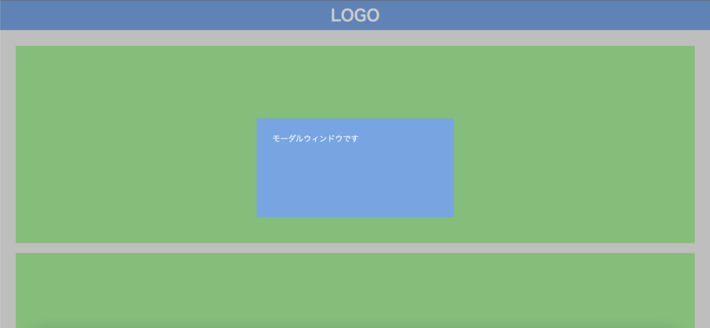
今回作るのは、このように右上のボタンを押すと開閉するモーダルウィンドウです。
コードは以下のものになりますので、何か困ったことが起きたらここのコードと見比べてみてください。(コピペでも使えます)
<!DOCTYPE html>
<html lang="ja">
  <head>
    <meta charset="UTF-8" />
    <meta http-equiv="X-UA-Compatible" content="IE=edge" />
    <meta name="viewport" content="width=device-width, initial-scale=1.0" />
    <title>Document</title>
    <link rel="stylesheet" href="./resources/styles/destyle.css" />
    <link rel="stylesheet" href="./resources/styles/style.css" />
  </head>
  <body>
    <header class="Header">
      <h1 class="Logo">LOGO</h1>
    </header>
    <div class="Modal">モーダルウィンドウです</div>
    <div class="Overlay"></div>
    <main class="Main">
      <section class="Section"><button class="Button">ボタン</button></section>
      <section class="Section"><button class="Button">ボタン</button></section>
      <section class="Section"><button class="Button">ボタン</button></section>
      <section class="Section"><button class="Button">ボタン</button></section>
      <section class="Section"><button class="Button">ボタン</button></section>
      <section class="Section"><button class="Button">ボタン</button></section>
      <section class="Section"><button class="Button">ボタン</button></section>
    </main>
    <script
      src="https://code.jquery.com/jquery-3.6.0.slim.min.js"
      integrity="sha256-u7e5khyithlIdTpu22PHhENmPcRdFiHRjhAuHcs05RI="
      crossorigin="anonymous"
    ></script>
    <script>
      const body = document.body
      const button = $(".Button")
      const modal = $(".Modal")
      const overlay = $(".Overlay")

      const toggleModal = () => {
        modal.toggleClass("Modal__isOpen")
        overlay.toggleClass("Overlay__isOpen")
      }

      const toggleScroll = () => {
        if (isAllowedScroll === true) {
          fixedScroll()
          isAllowedScroll = false
          return
        }

        if (isAllowedScroll === false) {
          releaseScroll()
          isAllowedScroll = true
          return
        }
      }

      let isAllowedScroll = true

      const fixedScroll = () => {
        document.body.style.top = `-${window.scrollY}px`
        document.body.style.position = "fixed"
      }

      const releaseScroll = () => {
        const top = document.body.style.top
        document.body.style.position = ""
        document.body.style.top = ""
        window.scrollTo({
          top: parseInt(top) * -1,
        })
      }

      button.on("click", () => {
        toggleModal()
        toggleScroll()
      })

      overlay.on("click", () => {
        toggleModal()
        toggleScroll()
      })
    </script>
  </body>
</html>body {
width: 100%;
}
.Header {
width: 100%;
height: 60px;
background-color: #6ba6e7;
display: flex;
justify-content: center;
align-items: center;
}
.Logo {
color: #fff;
font-size: 32px;
font-weight: bold;
}
.Main {
width: 100%;
padding-top: 12px;
padding-left: 32px;
padding-right: 32px;
padding-bottom: 32px;
background-color: #eee;
}
.Section {
margin-top: 20px;
width: 100%;
height: 400px;
background-color: lightgreen;
}
.Modal {
position: fixed;
top: 0;
bottom: 0;
left: 0;
right: 0;
z-index: 20;
margin: auto;
width: 400px;
height: 200px;
padding: 32px;
color: #fff;
background-color: #6ba6e7;
visibility: hidden;
opacity: 0;
transition: all 0.3s;
}
.Modal__isOpen {
visibility: visible;
opacity: 1;
}
.Overlay {
position: fixed;
top: 0;
left: 0;
z-index: 10;
width: 100vw;
height: 100vh;
background-color: rgba(0, 0, 0, 0.2);
visibility: hidden;
opacity: 0;
transition: all 0.3s;
}
.Overlay__isOpen {
visibility: visible;
opacity: 1;
}
.Button {
width: 120px;
padding: 16px;
display: flex;
justify-content: center;
align-items: center;
background-color: #6ba6e7;
color: #fff;
}実装
準備
コードを書き始める前に、ディレクトリ構成の確認とリセットCSSの導入です。
├── index.html
├── resources
└── styles
├── destyle.css
└── style.css
上記の形でファイルを配置しましょう。stylesはルートディレクトリ直下でも良いですが、実際にはresourcesの中にimagesフォルダなどと一緒に入っている形が多いのでそのようにしました。
destyle.cssというのがリセットCSSで、詳細な説明は省きますが各種タグに初期で当たっている様々な余計なスタイルを打ち消してくれるものです。
今回はこちら(https://github.com/nicolas-cusan/destyle.css/blob/master/destyle.css)のものを利用します。こちらのコードをそのままコピーしてdestyle.cssとして上記の場所に配置します。
/*! destyle.css v3.0.0 | MIT License | https://github.com/nicolas-cusan/destyle.css */

/* Reset box-model and set borders */
/* ============================================ */

*,
::before,
::after {
  box-sizing: border-box;
  border-style: solid;
  border-width: 0;
}

/* Document */
/* ============================================ */

/**
 * 1. Correct the line height in all browsers.
 * 2. Prevent adjustments of font size after orientation changes in iOS.
 * 3. Remove gray overlay on links for iOS.
 */

html {
  line-height: 1.15; /* 1 */
  -webkit-text-size-adjust: 100%; /* 2 */
  -webkit-tap-highlight-color: transparent; /* 3*/
}

/* Sections */
/* ============================================ */

/**
 * Remove the margin in all browsers.
 */

body {
  margin: 0;
}

/**
 * Render the `main` element consistently in IE.
 */

main {
  display: block;
}

/* Vertical rhythm */
/* ============================================ */

p,
table,
blockquote,
address,
pre,
iframe,
form,
figure,
dl {
  margin: 0;
}

/* Headings */
/* ============================================ */

h1,
h2,
h3,
h4,
h5,
h6 {
  font-size: inherit;
  font-weight: inherit;
  margin: 0;
}

/* Lists (enumeration) */
/* ============================================ */

ul,
ol {
  margin: 0;
  padding: 0;
  list-style: none;
}

/* Lists (definition) */
/* ============================================ */

dt {
  font-weight: bold;
}

dd {
  margin-left: 0;
}

/* Grouping content */
/* ============================================ */

/**
 * 1. Add the correct box sizing in Firefox.
 * 2. Show the overflow in Edge and IE.
 */

hr {
  box-sizing: content-box; /* 1 */
  height: 0; /* 1 */
  overflow: visible; /* 2 */
  border-top-width: 1px;
  margin: 0;
  clear: both;
  color: inherit;
}

/**
 * 1. Correct the inheritance and scaling of font size in all browsers.
 * 2. Correct the odd `em` font sizing in all browsers.
 */

pre {
  font-family: monospace, monospace; /* 1 */
  font-size: inherit; /* 2 */
}

address {
  font-style: inherit;
}

/* Text-level semantics */
/* ============================================ */

/**
 * Remove the gray background on active links in IE 10.
 */

a {
  background-color: transparent;
  text-decoration: none;
  color: inherit;
}

/**
 * 1. Remove the bottom border in Chrome 57-
 * 2. Add the correct text decoration in Chrome, Edge, IE, Opera, and Safari.
 */

abbr[title] {
  text-decoration: underline dotted; /* 2 */
}

/**
 * Add the correct font weight in Chrome, Edge, and Safari.
 */

b,
strong {
  font-weight: bolder;
}

/**
 * 1. Correct the inheritance and scaling of font size in all browsers.
 * 2. Correct the odd `em` font sizing in all browsers.
 */

code,
kbd,
samp {
  font-family: monospace, monospace; /* 1 */
  font-size: inherit; /* 2 */
}

/**
 * Add the correct font size in all browsers.
 */

small {
  font-size: 80%;
}

/**
 * Prevent `sub` and `sup` elements from affecting the line height in
 * all browsers.
 */

sub,
sup {
  font-size: 75%;
  line-height: 0;
  position: relative;
  vertical-align: baseline;
}

sub {
  bottom: -0.25em;
}

sup {
  top: -0.5em;
}

/* Replaced content */
/* ============================================ */

/**
 * Prevent vertical alignment issues.
 */

svg,
img,
embed,
object,
iframe {
  vertical-align: bottom;
}

/* Forms */
/* ============================================ */

/**
 * Reset form fields to make them styleable.
 * 1. Make form elements stylable across systems iOS especially.
 * 2. Inherit text-transform from parent.
 */

button,
input,
optgroup,
select,
textarea {
  -webkit-appearance: none; /* 1 */
  appearance: none;
  vertical-align: middle;
  color: inherit;
  font: inherit;
  background: transparent;
  padding: 0;
  margin: 0;
  border-radius: 0;
  text-align: inherit;
  text-transform: inherit; /* 2 */
}

/**
 * Reset radio and checkbox appearance to preserve their look in iOS.
 */

[type="checkbox"] {
  -webkit-appearance: checkbox;
  appearance: checkbox;
}

[type="radio"] {
  -webkit-appearance: radio;
  appearance: radio;
}

/**
 * Correct cursors for clickable elements.
 */

button,
[type="button"],
[type="reset"],
[type="submit"] {
  cursor: pointer;
}

button:disabled,
[type="button"]:disabled,
[type="reset"]:disabled,
[type="submit"]:disabled {
  cursor: default;
}

/**
 * Improve outlines for Firefox and unify style with input elements & buttons.
 */

:-moz-focusring {
  outline: auto;
}

select:disabled {
  opacity: inherit;
}

/**
 * Remove padding
 */

option {
  padding: 0;
}

/**
 * Reset to invisible
 */

fieldset {
  margin: 0;
  padding: 0;
  min-width: 0;
}

legend {
  padding: 0;
}

/**
 * Add the correct vertical alignment in Chrome, Firefox, and Opera.
 */

progress {
  vertical-align: baseline;
}

/**
 * Remove the default vertical scrollbar in IE 10+.
 */

textarea {
  overflow: auto;
}

/**
 * Correct the cursor style of increment and decrement buttons in Chrome.
 */

[type="number"]::-webkit-inner-spin-button,
[type="number"]::-webkit-outer-spin-button {
  height: auto;
}

/**
 * 1. Correct the outline style in Safari.
 */

[type="search"] {
  outline-offset: -2px; /* 1 */
}

/**
 * Remove the inner padding in Chrome and Safari on macOS.
 */

[type="search"]::-webkit-search-decoration {
  -webkit-appearance: none;
}

/**
 * 1. Correct the inability to style clickable types in iOS and Safari.
 * 2. Fix font inheritance.
 */

::-webkit-file-upload-button {
  -webkit-appearance: button; /* 1 */
  font: inherit; /* 2 */
}

/**
 * Clickable labels
 */

label[for] {
  cursor: pointer;
}

/* Interactive */
/* ============================================ */

/*
 * Add the correct display in Edge, IE 10+, and Firefox.
 */

details {
  display: block;
}

/*
 * Add the correct display in all browsers.
 */

summary {
  display: list-item;
}

/*
 * Remove outline for editable content.
 */

[contenteditable]:focus {
  outline: auto;
}

/* Tables */
/* ============================================ */

/**
1. Correct table border color inheritance in all Chrome and Safari.
*/

table {
  border-color: inherit; /* 1 */
}

caption {
  text-align: left;
}

td,
th {
  vertical-align: top;
  padding: 0;
}

th {
  text-align: left;
  font-weight: bold;
}
見た目を作る
ヘッダーとコンテンツ部分
それでは見た目から作りましょう。ヘッダーとコンテンツ部分を用意していきます。
<!DOCTYPE html>
<html lang="ja">
  <head>
    <meta charset="UTF-8" />
    <meta http-equiv="X-UA-Compatible" content="IE=edge" />
    <meta name="viewport" content="width=device-width, initial-scale=1.0" />
    <title>Document</title>
    <link rel="stylesheet" href="./resources/styles/destyle.css" />
    <link rel="stylesheet" href="./resources/styles/style.css" />
  </head>
  <body>
    <header class="Header">
      <h1 class="Logo">LOGO</h1>
    </header>
    <main class="Main">
      <section class="Section"></section>
      <section class="Section"></section>
      <section class="Section"></section>
      <section class="Section"></section>
      <section class="Section"></section>
      <section class="Section"></section>
      <section class="Section"></section>
    </main>
  </body>
</html>
.Header {
width: 100%;
height: 60px;
background-color: #6ba6e7;
display: flex;
justify-content: center;
align-items: center;
}
.Logo {
color: #fff;
font-size: 32px;
font-weight: bold;
}
.Main {
width: 100%;
padding-top: 12px;
padding-left: 32px;
padding-right: 32px;
padding-bottom: 32px;
background-color: #eee;
}
.Section {
margin-top: 20px;
width: 100%;
height: 400px;
background-color: lightgreen;
}
モーダルウィンドウ部分
続いてモーダルウィンドウとボタンです。
先にモーダルウィンドウから配置して行きます。コンテンツの部分と、背景のグレーの部分です。
<body>
  <header class="Header">
    ...省略
  </header>

    <!-- ここから -->
  <div class="Modal">モーダルウィンドウです</div>
  <div class="Overlay"></div>
    <!-- ここまで -->

  <main class="Main">
    ...省略
  </main>
</body>
.Modal {
position: fixed;
top: 0;
bottom: 0;
left: 0;
right: 0;
z-index: 20;
margin: auto;
width: 400px;
height: 200px;
padding: 32px;
color: #fff;
background-color: #6ba6e7;
}
.Overlay {
position: fixed;
top: 0;
left: 0;
z-index: 10;
width: 100vw;
height: 100vh;
background-color: rgba(0, 0, 0, 0.2);
}モーダルウィンドウの中央揃えが少し珍しい方法を使っています。
positionがabsoluteやfixedの時に使える方法で、top/left/right/bottomを全て0にした上でmarginをautoにすると、中央に配置されます。
横方向のみ、縦方向のみに適用させることも可能で、横方向の場合はleft/rightを0にしてmargin-left/margin-rightをautoに、縦方向の場合はtop/bottomを0にしてmargin-top/margin-bottomをautoにすればそれぞれの方向の中央に揃います。
追記:なぜこの方法で中央揃えになるのか、詳しく解説しました。
さて、最初はモーダルウィンドウは非表示でボタンを押した時に表示されます。非表示にするのと、jQueryで付け替える用のクラスの用意を行いましょう。アニメーションの設定もしておきます。
.Modal {
  ...省略

  visibility: hidden;
  opacity: 0;
  transition: all 0.3s;
}

.Modal__isOpen {
  visibility: visible;
  opacity: 1;
}

.Overlay {
  ...省略

  visibility: hidden;
  opacity: 0;
  transition: all 0.3s;
}

.Overlay__isOpen {
  visibility: visible;
  opacity: 1;
}
このようにvisibilityとopacityプロパティを用います。visibility: hidden;はdisplay: none;と似たような性質を持ちますがアニメーションを適用できるという違いがあります。
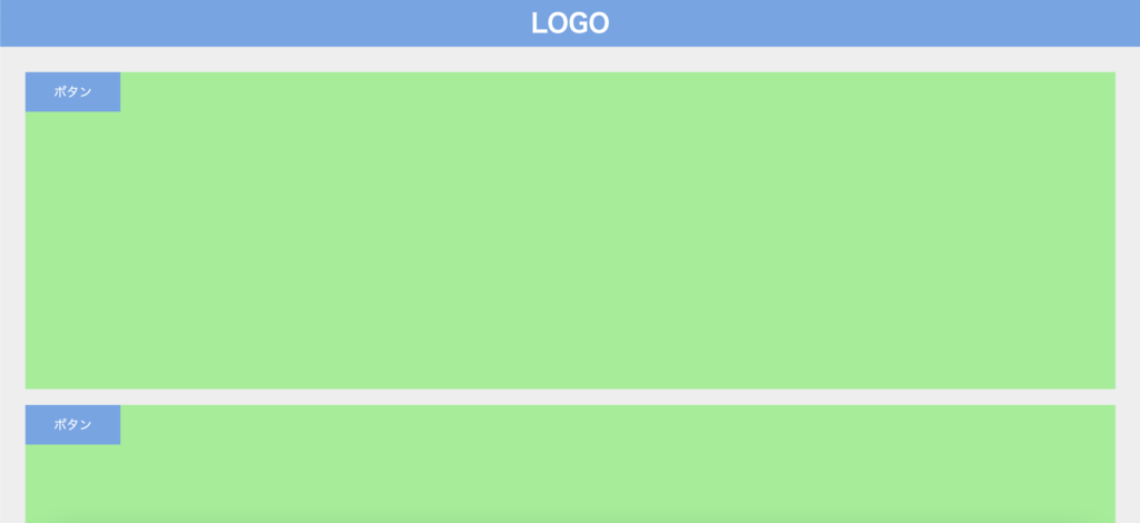
次にボタンを配置します。
<main class="Main">
  <section class="Section">
    <button class="Button">ボタン</button>
  </section>
  <section class="Section">
    <button class="Button">ボタン</button>
  </section>
  <section class="Section">
    <button class="Button">ボタン</button>
  </section>
  <section class="Section">
    <button class="Button">ボタン</button>
  </section>
  <section class="Section">
    <button class="Button">ボタン</button>
  </section>
  <section class="Section">
    <button class="Button">ボタン</button>
  </section>
  <section class="Section">
    <button class="Button">ボタン</button>
  </section>
</main>
.Button {
width: 120px;
padding: 16px;
display: flex;
justify-content: center;
align-items: center;
background-color: #6ba6e7;
color: #fff;
}これで見た目が出来ました。
動きをつける
さて、いよいよjQueryでクラスの付け替えをしていきます。まずはjQueryを読み込みます。
<body>
  <header>...省略</header>
    <div class="Modal">モーダルウィンドウです</div>
  <div class="Overlay"></div>
  <main>...省略</main>

  //追加
  <script
    src="https://code.jquery.com/jquery-3.6.0.slim.min.js"
    integrity="sha256-u7e5khyithlIdTpu22PHhENmPcRdFiHRjhAuHcs05RI="
    crossorigin="anonymous"
  ></script>

    <script>
    //ここに追加
  </script>
</body>
scriptタグはbodyの一番下に書いてください。そして、その次の行からクラス付け替えのコードを実装します。
<script>
  const modal = $(".Modal")
  const overlay = $(".Overlay")
  const button = $(".Button")

  const toggleModal = () => {
    modal.toggleClass("Modal__isOpen")
    overlay.toggleClass("Overlay__isOpen")
  }

  button.on("click", () => {
    toggleModal()
  })

  overlay.on("click", () => {
    toggleModal()
  })
</script>
モーダルと背景部分に対してクラスを付け替えて行きます。ボタンを押した時と背景部分を押した時に開閉がされるようになります。
背景のスクロールを止める
最後に、モーダルウィンドウが開いているときはスクロールできないようにしていきます。開いている時はスクロールを禁止し、閉じたら再度スクロールができるようになる必要があります。
そこでスクロールをして良いかを判定する変数を用意し、それを使って分岐を行います。fixedScroll関数でスクロールを固定に、releaseScroll関数で固定されたスクロールを解放します。
const toggleModal = () => {
  ...省略
}


let isScrollAllowed = true //追加

//追加
const toggleScroll = () => {
  if (isScrollAllowed === true) {
    fixedScroll() //中身はこれから埋めます
    isScrollAllowed = false
    return
  }

  if (isScrollAllowed === false) {
    releaseScroll() //中身はこれから埋めます
    isScrollAllowed = true
    return
  }
}

button.on("click", () => {
  toggleMenu()
  toggleScroll() //追加
})

overlay.on("click", () => {
  toggleMenu()
  toggleScroll() //追加
})
では、スクロールをどう固定するかです。
実はbodyタグにposition: fixedをつけるだけでスクロールができなくなります。メニューを開く時にそれが起こるようにしましょう。
const toggleScroll = () => {
  ...省略
}

//追加
const fixedScroll = () => {
  document.body.style.position = "fixed"
}
ただ、これだけではコンテンツエリアのスタイルが崩れてしまうので、cssファイルに以下を追記しておきます。最上部に追記しましょう。
body {
  width: 100%
}
そして、メニューが閉じるときは今のと逆のことを行います。
const fixedScroll = () => {
  ...省略
}

//追加
const releaseScroll = () => {
  document.body.style.position = ""
}
これでスクロールの制御ができました。
しかし、これだけでは問題があります。ページを下部にいくらかスクロールした状態でメニューを開くとページ最上部にスクロールが戻ってしまいます。
そこで、すでにスクロールしていた高さ分、bodyを上にずらしましょう。topプロパティに負の値を指定すれば要素は上方向に移動します。
const fixedScroll = () => {
  document.body.style.top = `-${window.scrollY}px` //追加
  document.body.style.position = "fixed"
}

const releaseScroll = () => {
  document.body.style.position = ""
  document.body.style.top = "" //戻すのも忘れない
}
こうするとメニューを開いてもスクロール位置は変わりません。しかし、メニューを閉じるときにまたトップに戻ってしまうのでもうひと手間加えます。
const releaseScroll = () => {
  const top = document.body.style.top //ずらした高さを保持
  document.body.style.position = ""
  document.body.style.top = ""
  window.scrollTo({
    top: parseInt(top) * -1,
  }) //保持した高さ分スクロールさせる
}
このように、最初にずらした分だけ再度スクロールをさせてあげることでメニューを閉じた時にスクロール位置が変わらず元のコンテンツを閲覧できます。
ずらした高さはstyleから取得していますが、文字列かつ負の符号が付いています。そこで数値に変換(parseInt関数)してから符号を反転させています。
これでモーダルウィンドウ完成です!
まとめ
ということでモーダルウィンドウの作り方をなるべく細かく解説しました。
他にもいろんなパーツの解説をしていますので、ぜひご覧ください。
コメント