
こんにちは。今回はヘッダーのメニューとして良く使われるハンバーガーメニューの作り方を徹底的に解説していきます。
この記事は僕が書いている5歳でも分かるシリーズの1つです。こちらにスライドショーやタブメニューなどの作り方も載っていますのでぜひご覧ください。
「htmlはデータの構造」「cssはその見せ方を作るもの」「jsはクラスの付け替えによってその2つを操作するもの」と言う切り分け方を前提に、jQueryのaddClass/removeClass/toggleClassを用いた方法で実装します。
10/02追記
本シリーズはjQueryで解説をしておりますが、今後は基本的にVanilla JSなど別の方法で実装した方がベターかと思われます。→参考:https://itokoba.com/archives/4765
10/4追記
jQueryからVanilla JSに移行する際の手助けになるような情報をまとめた本をzennさんで出しました。ぜひお買い求めください。

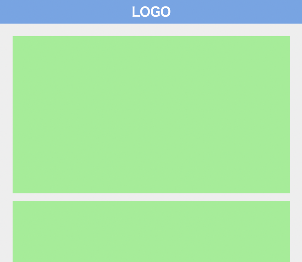
作るものの確認
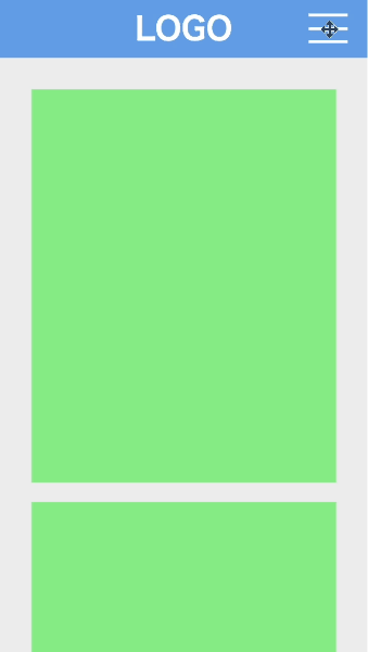
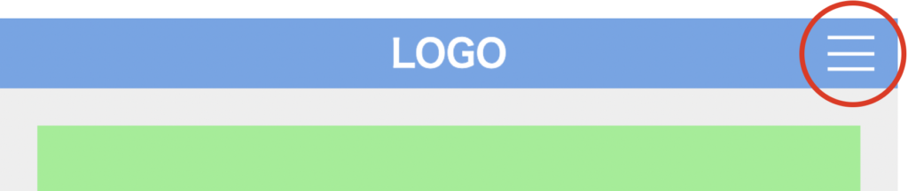
今回作るのは、このように右上のボタンを押すと開閉するメニューです。メニュー開閉の方法は様々ありますが、今回は横にスライドしながら開閉します。
コードは以下のものになりますので、何か困ったことが起きたらここのコードと見比べてみてください。(コピペでも使えます)
<!DOCTYPE html>
<html lang="ja">
  <head>
    <meta charset="UTF-8" />
    <meta http-equiv="X-UA-Compatible" content="IE=edge" />
    <meta name="viewport" content="width=device-width, initial-scale=1.0" />
    <title>Document</title>
    <link rel="stylesheet" href="./resources/styles/destyle.css" />
    <link rel="stylesheet" href="./resources/styles/style.css" />
  </head>
  <body>
    <header class="Header">
      <h1 class="Logo">LOGO</h1>
      <nav class="Menu">
        <div class="Menu-Header">MENU</div>
        <ul class="Menu-List">
          <li class="Menu-List-Item">
            <a href="./sample.html" class="Menu-List-Item-Link">アイテム1</a>
          </li>
          <li class="Menu-List-Item">
            <a href="./sample.html" class="Menu-List-Item-Link">アイテム2</a>
          </li>
          <li class="Menu-List-Item">
            <a href="./sample.html" class="Menu-List-Item-Link">アイテム3</a>
          </li>
          <li class="Menu-List-Item">
            <a href="./sample.html" class="Menu-List-Item-Link">アイテム4</a>
          </li>
          <li class="Menu-List-Item">
            <a href="./sample.html" class="Menu-List-Item-Link">アイテム5</a>
          </li>
          <li class="Menu-List-Item">
            <a href="./sample.html" class="Menu-List-Item-Link">アイテム6</a>
          </li>
          <li class="Menu-List-Item">
            <a href="./sample.html" class="Menu-List-Item-Link">アイテム7</a>
          </li>
          <li class="Menu-List-Item">
            <a href="./sample.html" class="Menu-List-Item-Link">アイテム8</a>
          </li>
        </ul>
      </nav>
      <button class="Button">
        <div class="Button-Line__Top"></div>
        <div class="Button-Line__Medium"></div>
        <div class="Button-Line__Bottom"></div>
      </button>
      <div class="Overlay"></div>
    </header>
    <main class="Main">
      <section class="Section"></section>
      <section class="Section"></section>
      <section class="Section"></section>
      <section class="Section"></section>
      <section class="Section"></section>
      <section class="Section"></section>
      <section class="Section"></section>
    </main>
    <script
      src="https://code.jquery.com/jquery-3.6.0.slim.min.js"
      integrity="sha256-u7e5khyithlIdTpu22PHhENmPcRdFiHRjhAuHcs05RI="
      crossorigin="anonymous"
    ></script>
    <script>
      const menu = $(".Menu")
      const button = $(".Button")
      const buttonLineTop = $(".Button-Line__Top")
      const buttonLineMedium = $(".Button-Line__Medium")
      const buttonLineBottom = $(".Button-Line__Bottom")
      const overlay = $(".Overlay")
      const body = $(document.body);

      const toggleMenu = () => {
        menu.toggleClass("Menu-isOpen")
        buttonLineTop.toggleClass("Button-Line__Top__isOpen")
        buttonLineMedium.toggleClass("Button-Line__Medium__isOpen")
        buttonLineBottom.toggleClass("Button-Line__Bottom__isOpen")
        overlay.toggleClass("Overlay__isOpen")
        body.toggleClass("IsScrollAllowed")
      }

      button.on("click", () => {
        toggleMenu()
      })

      overlay.on("click", () => {
        toggleMenu()
      })
    </script>
  </body>
</html>.Header {
width: 100%;
height: 60px;
background-color: #6ba6e7;
display: flex;
justify-content: center;
align-items: center;
}
.Logo {
color: #fff;
font-size: 32px;
font-weight: bold;
}
.Main {
width: 100%;
padding-top: 12px;
padding-left: 32px;
padding-right: 32px;
padding-bottom: 32px;
background-color: #eee;
}
.Section {
margin-top: 20px;
width: 100%;
height: 400px;
background-color: lightgreen;
}
.Menu {
position: fixed;
top: 0;
right: 0;
z-index: 20;
width: 80%;
max-width: 400px;
height: 100vh;
background-color: #fff;
transform: translateX(100%);
transition: all 0.3s;
}
.Menu-isOpen {
transform: translateX(0);
}
.Menu-Header {
width: 100%;
height: 60px;
background-color: #6ba6e7;
display: flex;
align-items: center;
justify-content: center;
color: #fff;
font-weight: bold;
font-size: 32px;
}
.Menu-List {
width: 100%;
padding-left: 8px;
padding-right: 8px;
}
.Menu-List-Item {
border-bottom: 1px solid #ccc;
width: 100%;
padding-top: 16px;
padding-bottom: 16px;
padding-left: 32px;
font-weight: bold;
}
.Button {
position: fixed;
top: 0;
right: 0;
z-index: 30;
height: 60px;
padding-left: 10px;
padding-right: 20px;
}
.Button-Line__Top {
position: absolute;
top: 15px;
width: 40px;
height: 3px;
background-color: #fff;
transition: all 0.3s;
}
.Button-Line__Top__isOpen {
transform: translateY(13.5px) rotate(45deg);
}
.Button-Line__Medium {
width: 40px;
height: 3px;
background-color: #fff;
transition: all 0.3s;
}
.Button-Line__Medium__isOpen {
opacity: 0;
}
.Button-Line__Bottom {
position: absolute;
bottom: 15px;
width: 40px;
height: 3px;
background-color: #fff;
transition: all 0.3s;
}
.Button-Line__Bottom__isOpen {
transform: translateY(-13.5px) rotate(-45deg);
}
.Overlay {
position: fixed;
top: 0;
left: 0;
z-index: 10;
width: 0;
height: 0;
background-color: rgba(0, 0, 0, 0.2);
opacity: 0;
transition: opacity 0.3s;
}
.Overlay__isOpen {
width: 100vw;
height: 100vh;
opacity: 1;
}
.IsScrollAllowed {
overflow: hidden
}実装
準備
コードを書き始める前に、ディレクトリ構成の確認とリセットCSSの導入です。
├── index.html
├── resources
│ └── styles
│ ├── destyle.css
│ └── style.css
└── sample.html
上記の形でファイルを配置しましょう。stylesはルートディレクトリ直下でも良いですが、実際にはresourcesの中にimagesフォルダなどと一緒に入っている形が多いのでそのようにしました。またsample.htmlはメニューから遷移する用に一応用意しているだけのものなので、中身は適当で大丈夫です。
destyle.cssというのがリセットCSSで、詳細な説明は省きますが各種タグに初期で当たっている様々な余計なスタイルを打ち消してくれるものです。
今回はこちら(https://github.com/nicolas-cusan/destyle.css/blob/master/destyle.css)のものを利用します。こちらのコードをそのままコピーしてdestyle.cssとして上記の場所に配置します。
/*! destyle.css v3.0.0 | MIT License | https://github.com/nicolas-cusan/destyle.css */

/* Reset box-model and set borders */
/* ============================================ */

*,
::before,
::after {
  box-sizing: border-box;
  border-style: solid;
  border-width: 0;
}

/* Document */
/* ============================================ */

/**
 * 1. Correct the line height in all browsers.
 * 2. Prevent adjustments of font size after orientation changes in iOS.
 * 3. Remove gray overlay on links for iOS.
 */

html {
  line-height: 1.15; /* 1 */
  -webkit-text-size-adjust: 100%; /* 2 */
  -webkit-tap-highlight-color: transparent; /* 3*/
}

/* Sections */
/* ============================================ */

/**
 * Remove the margin in all browsers.
 */

body {
  margin: 0;
}

/**
 * Render the `main` element consistently in IE.
 */

main {
  display: block;
}

/* Vertical rhythm */
/* ============================================ */

p,
table,
blockquote,
address,
pre,
iframe,
form,
figure,
dl {
  margin: 0;
}

/* Headings */
/* ============================================ */

h1,
h2,
h3,
h4,
h5,
h6 {
  font-size: inherit;
  font-weight: inherit;
  margin: 0;
}

/* Lists (enumeration) */
/* ============================================ */

ul,
ol {
  margin: 0;
  padding: 0;
  list-style: none;
}

/* Lists (definition) */
/* ============================================ */

dt {
  font-weight: bold;
}

dd {
  margin-left: 0;
}

/* Grouping content */
/* ============================================ */

/**
 * 1. Add the correct box sizing in Firefox.
 * 2. Show the overflow in Edge and IE.
 */

hr {
  box-sizing: content-box; /* 1 */
  height: 0; /* 1 */
  overflow: visible; /* 2 */
  border-top-width: 1px;
  margin: 0;
  clear: both;
  color: inherit;
}

/**
 * 1. Correct the inheritance and scaling of font size in all browsers.
 * 2. Correct the odd `em` font sizing in all browsers.
 */

pre {
  font-family: monospace, monospace; /* 1 */
  font-size: inherit; /* 2 */
}

address {
  font-style: inherit;
}

/* Text-level semantics */
/* ============================================ */

/**
 * Remove the gray background on active links in IE 10.
 */

a {
  background-color: transparent;
  text-decoration: none;
  color: inherit;
}

/**
 * 1. Remove the bottom border in Chrome 57-
 * 2. Add the correct text decoration in Chrome, Edge, IE, Opera, and Safari.
 */

abbr[title] {
  text-decoration: underline dotted; /* 2 */
}

/**
 * Add the correct font weight in Chrome, Edge, and Safari.
 */

b,
strong {
  font-weight: bolder;
}

/**
 * 1. Correct the inheritance and scaling of font size in all browsers.
 * 2. Correct the odd `em` font sizing in all browsers.
 */

code,
kbd,
samp {
  font-family: monospace, monospace; /* 1 */
  font-size: inherit; /* 2 */
}

/**
 * Add the correct font size in all browsers.
 */

small {
  font-size: 80%;
}

/**
 * Prevent `sub` and `sup` elements from affecting the line height in
 * all browsers.
 */

sub,
sup {
  font-size: 75%;
  line-height: 0;
  position: relative;
  vertical-align: baseline;
}

sub {
  bottom: -0.25em;
}

sup {
  top: -0.5em;
}

/* Replaced content */
/* ============================================ */

/**
 * Prevent vertical alignment issues.
 */

svg,
img,
embed,
object,
iframe {
  vertical-align: bottom;
}

/* Forms */
/* ============================================ */

/**
 * Reset form fields to make them styleable.
 * 1. Make form elements stylable across systems iOS especially.
 * 2. Inherit text-transform from parent.
 */

button,
input,
optgroup,
select,
textarea {
  -webkit-appearance: none; /* 1 */
  appearance: none;
  vertical-align: middle;
  color: inherit;
  font: inherit;
  background: transparent;
  padding: 0;
  margin: 0;
  border-radius: 0;
  text-align: inherit;
  text-transform: inherit; /* 2 */
}

/**
 * Reset radio and checkbox appearance to preserve their look in iOS.
 */

[type="checkbox"] {
  -webkit-appearance: checkbox;
  appearance: checkbox;
}

[type="radio"] {
  -webkit-appearance: radio;
  appearance: radio;
}

/**
 * Correct cursors for clickable elements.
 */

button,
[type="button"],
[type="reset"],
[type="submit"] {
  cursor: pointer;
}

button:disabled,
[type="button"]:disabled,
[type="reset"]:disabled,
[type="submit"]:disabled {
  cursor: default;
}

/**
 * Improve outlines for Firefox and unify style with input elements & buttons.
 */

:-moz-focusring {
  outline: auto;
}

select:disabled {
  opacity: inherit;
}

/**
 * Remove padding
 */

option {
  padding: 0;
}

/**
 * Reset to invisible
 */

fieldset {
  margin: 0;
  padding: 0;
  min-width: 0;
}

legend {
  padding: 0;
}

/**
 * Add the correct vertical alignment in Chrome, Firefox, and Opera.
 */

progress {
  vertical-align: baseline;
}

/**
 * Remove the default vertical scrollbar in IE 10+.
 */

textarea {
  overflow: auto;
}

/**
 * Correct the cursor style of increment and decrement buttons in Chrome.
 */

[type="number"]::-webkit-inner-spin-button,
[type="number"]::-webkit-outer-spin-button {
  height: auto;
}

/**
 * 1. Correct the outline style in Safari.
 */

[type="search"] {
  outline-offset: -2px; /* 1 */
}

/**
 * Remove the inner padding in Chrome and Safari on macOS.
 */

[type="search"]::-webkit-search-decoration {
  -webkit-appearance: none;
}

/**
 * 1. Correct the inability to style clickable types in iOS and Safari.
 * 2. Fix font inheritance.
 */

::-webkit-file-upload-button {
  -webkit-appearance: button; /* 1 */
  font: inherit; /* 2 */
}

/**
 * Clickable labels
 */

label[for] {
  cursor: pointer;
}

/* Interactive */
/* ============================================ */

/*
 * Add the correct display in Edge, IE 10+, and Firefox.
 */

details {
  display: block;
}

/*
 * Add the correct display in all browsers.
 */

summary {
  display: list-item;
}

/*
 * Remove outline for editable content.
 */

[contenteditable]:focus {
  outline: auto;
}

/* Tables */
/* ============================================ */

/**
1. Correct table border color inheritance in all Chrome and Safari.
*/

table {
  border-color: inherit; /* 1 */
}

caption {
  text-align: left;
}

td,
th {
  vertical-align: top;
  padding: 0;
}

th {
  text-align: left;
  font-weight: bold;
}
見た目を作る
ヘッダーとコンテンツ部分
それでは見た目から作りましょう。ヘッダーとコンテンツ部分を用意していきます。
<!DOCTYPE html>
<html lang="ja">
  <head>
    <meta charset="UTF-8" />
    <meta http-equiv="X-UA-Compatible" content="IE=edge" />
    <meta name="viewport" content="width=device-width, initial-scale=1.0" />
    <title>Document</title>
    <link rel="stylesheet" href="./resources/styles/destyle.css" />
    <link rel="stylesheet" href="./resources/styles/style.css" />
  </head>
  <body>
    <header class="Header">
      <h1 class="Logo">LOGO</h1>
    </header>
    <main class="Main">
      <section class="Section"></section>
      <section class="Section"></section>
      <section class="Section"></section>
      <section class="Section"></section>
      <section class="Section"></section>
      <section class="Section"></section>
      <section class="Section"></section>
    </main>
  </body>
</html>
.Header {
width: 100%;
height: 60px;
background-color: #6ba6e7;
display: flex;
justify-content: center;
align-items: center;
}
.Logo {
color: #fff;
font-size: 32px;
font-weight: bold;
}
.Main {
width: 100%;
padding-top: 12px;
padding-left: 32px;
padding-right: 32px;
padding-bottom: 32px;
background-color: #eee;
}
.Section {
margin-top: 20px;
width: 100%;
height: 400px;
background-color: lightgreen;
}メニュー部分
次にメニューボタンとメニューの中身を作ります。
メニューの中身から配置していきます。ヘッダータグ内に配置します。
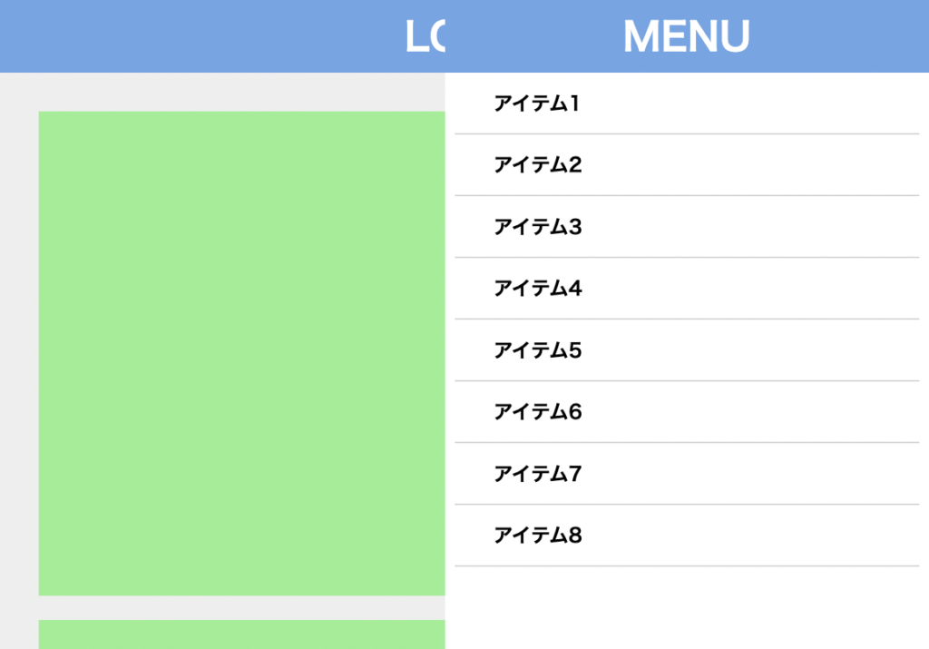
<header class="Header">
<h1 class="Logo">LOGO</h1>
<!-- ここから -->
<nav class="Menu">
<div class="Menu-Header">MENU</div>
<ul class="Menu-List">
<li class="Menu-List-Item">
<a href="./sample.html" class="Menu-List-Item-Link">アイテム1</a>
</li>
<li class="Menu-List-Item">
<a href="./sample.html" class="Menu-List-Item-Link">アイテム2</a>
</li>
<li class="Menu-List-Item">
<a href="./sample.html" class="Menu-List-Item-Link">アイテム3</a>
</li>
<li class="Menu-List-Item">
<a href="./sample.html" class="Menu-List-Item-Link">アイテム4</a>
</li>
<li class="Menu-List-Item">
<a href="./sample.html" class="Menu-List-Item-Link">アイテム5</a>
</li>
<li class="Menu-List-Item">
<a href="./sample.html" class="Menu-List-Item-Link">アイテム6</a>
</li>
<li class="Menu-List-Item">
<a href="./sample.html" class="Menu-List-Item-Link">アイテム7</a>
</li>
<li class="Menu-List-Item">
<a href="./sample.html" class="Menu-List-Item-Link">アイテム8</a>
</li>
</ul>
</nav>
<!-- ここまで -->
</header>.Menu {
position: fixed;
top: 0;
right: 0;
z-index: 20;
width: 80%;
max-width: 400px;
height: 100vh;
background-color: #fff;
}
.Menu-Header {
width: 100%;
height: 60px;
background-color: #6ba6e7;
display: flex;
align-items: center;
justify-content: center;
color: #fff;
font-weight: bold;
font-size: 32px;
}
.Menu-List {
width: 100%;
padding-left: 8px;
padding-right: 8px;
}
.Menu-List-Item {
border-bottom: 1px solid #ccc;
width: 100%;
padding-top: 16px;
padding-bottom: 16px;
padding-left: 32px;
font-weight: bold;
}実際は、メニューは初期では見えない状態になります。見えないようにする方法は様々ありますが、今回は画面外に移動させる方法を用いましょう。
.Menu {
position: fixed;
top: 0;
right: 0;
z-index: 20;
width: 80%;
max-width: 400px;
height: 100vh;
background-color: #fff;
transform: translateX(100%); /* 追加 */
}X方向(横方向)に横幅分(100%)ずらすため、transformプロパティとtranslateXというキーワードを用います。translateXの値にはpxなどの他の単位を使うこともできます。
次はボタン。こちらもヘッダータグ内に配置します。
<header class="Header">
<h1 class="Logo">LOGO</h1>
<!-- ここから -->
<button class="Button">
<div class="Button-Line__Top"></div>
<div class="Button-Line__Medium"></div>
<div class="Button-Line__Bottom"></div>
</button>
<!-- ここまで -->
<nav class="Menu">
...省略
</nav>
</header>.Button {
position: fixed;
top: 0;
right: 0;
z-index: 30;
height: 60px;
padding-left: 10px;
padding-right: 20px;
}
.Button-Line__Top {
position: absolute;
top: 15px;
width: 40px;
height: 3px;
background-color: #fff;
}
.Button-Line__Medium {
width: 40px;
height: 3px;
background-color: #fff;
}
.Button-Line__Bottom {
position: absolute;
bottom: 15px;
width: 40px;
height: 3px;
background-color: #fff;
}これである程度見た目ができました。
動きをつける
最初に述べた通り、jQueryによるクラスの付け替えによって実現します。
まずは付け替えるスタイルです。先ほどメニューを見えないようにtransformプロパティで画面外に移動させましたが、それを打ち消すようなcssを用意します。
.Menu-isOpen {
transform: translateX(0);
}このクラスを、ボタンを押すたびに付けたり外したりします。
さて、いよいよjQueryでクラスの付け替えをしていきます。まずはjQueryを読み込みます。
<body>
<header>...省略</header>
<main>...省略</main>
//追加
<script
src="https://code.jquery.com/jquery-3.6.0.slim.min.js"
integrity="sha256-u7e5khyithlIdTpu22PHhENmPcRdFiHRjhAuHcs05RI="
crossorigin="anonymous"
></script>
</body>scriptタグはbodyの一番下に書いてください。そして、その次の行にクラス付け替えのコードを実装します。
<script>
const menu = $(".Menu")
const button = $(".Button")
const toggleMenu = () => {
menu.toggleClass("Menu-isOpen")
}
button.on("click", () => {
toggleMenu()
})
</script>.Buttonが押された時に、.Menuに.Menu-isOpenというクラスが付いたり外れたりします。それによってメニューの位置がtranslateXの値によって移動し、開閉を表現します。

これで最低限の動きを作ることができました。
ここまでのコードは以下です。
<!DOCTYPE html>
<html lang="ja">
<head>
<meta charset="UTF-8" />
<meta http-equiv="X-UA-Compatible" content="IE=edge" />
<meta name="viewport" content="width=device-width, initial-scale=1.0" />
<title>Document</title>
<link rel="stylesheet" href="./resources/styles/destyle.css" />
<link rel="stylesheet" href="./resources/styles/style.css" />
</head>
<body>
<header class="Header">
<h1 class="Logo">LOGO</h1>
<nav class="Menu">
<div class="Menu-Header">MENU</div>
<ul class="Menu-List">
<li class="Menu-List-Item">
<a href="./sample.html" class="Menu-List-Item-Link">アイテム1</a>
</li>
<li class="Menu-List-Item">
<a href="./sample.html" class="Menu-List-Item-Link">アイテム2</a>
</li>
<li class="Menu-List-Item">
<a href="./sample.html" class="Menu-List-Item-Link">アイテム3</a>
</li>
<li class="Menu-List-Item">
<a href="./sample.html" class="Menu-List-Item-Link">アイテム4</a>
</li>
<li class="Menu-List-Item">
<a href="./sample.html" class="Menu-List-Item-Link">アイテム5</a>
</li>
<li class="Menu-List-Item">
<a href="./sample.html" class="Menu-List-Item-Link">アイテム6</a>
</li>
<li class="Menu-List-Item">
<a href="./sample.html" class="Menu-List-Item-Link">アイテム7</a>
</li>
<li class="Menu-List-Item">
<a href="./sample.html" class="Menu-List-Item-Link">アイテム8</a>
</li>
</ul>
</nav>
<button class="Button">
<div class="Button-Line__Top"></div>
<div class="Button-Line__Medium"></div>
<div class="Button-Line__Bottom"></div>
</button>
</header>
<main class="Main">
<section class="Section"></section>
<section class="Section"></section>
<section class="Section"></section>
<section class="Section"></section>
<section class="Section"></section>
<section class="Section"></section>
<section class="Section"></section>
</main>
<script
src="https://code.jquery.com/jquery-3.6.0.slim.min.js"
integrity="sha256-u7e5khyithlIdTpu22PHhENmPcRdFiHRjhAuHcs05RI="
crossorigin="anonymous"
></script>
<script>
const menu = $(".Menu")
const button = $(".Button")
const toggleMenu = () => {
menu.toggleClass("Menu-isOpen")
}
button.on("click", () => {
toggleMenu()
})
</script>
</body>
</html>
.Header {
  width: 100%;
  height: 60px;
  background-color: #6ba6e7;
  display: flex;
  justify-content: center;
  align-items: center;
}

.Logo {
  color: #fff;
  font-size: 32px;
  font-weight: bold;
}

.Main {
  width: 100%;
  padding-top: 12px;
  padding-left: 32px;
  padding-right: 32px;
  padding-bottom: 32px;
  background-color: #eee;
}

.Section {
  margin-top: 20px;
  width: 100%;
  height: 400px;
  background-color: lightgreen;
}
.Menu {
position: fixed;
top: 0;
right: 0;
z-index: 20;
width: 80%;
max-width: 400px;
height: 100vh;
background-color: #fff;
/* transition: all 0.3s; */
transform: translateX(100%);
}
.Menu-isOpen {
transform: translateX(0);
}
.Menu-Header {
width: 100%;
height: 60px;
background-color: #6ba6e7;
display: flex;
align-items: center;
justify-content: center;
color: #fff;
font-weight: bold;
font-size: 32px;
}
.Menu-List {
width: 100%;
padding-left: 8px;
padding-right: 8px;
}
.Menu-List-Item {
border-bottom: 1px solid #ccc;
width: 100%;
padding-top: 16px;
padding-bottom: 16px;
padding-left: 32px;
font-weight: bold;
}
.Button {
  position: fixed;
  top: 0;
  right: 0;
  z-index: 30;
  height: 60px;
  padding-left: 10px;
  padding-right: 20px;
}

.Button-Line__Top {
  position: absolute;
  top: 15px;
  width: 40px;
  height: 3px;
  background-color: #fff;
}

.Button-Line__Medium {
  width: 40px;
  height: 3px;
  background-color: #fff;
}

.Button-Line__Bottom {
  position: absolute;
  bottom: 15px;
  width: 40px;
  height: 3px;
  background-color: #fff;
}
見た目や動きを細かく作り込んでいく
ここから様々な箇所を作り込んでいきます。開閉時のアニメーションを追加したり、メニューが開いている時は余白部分をグレーで透過させたり、実際のサイトでもよく見られる形にレベルアップさせましょう。
開閉時のアニメーションをつける

開閉時のアニメーションは、transitionというプロパティで実現します。アニメーションをさせたい要素のスタイルに付与します。
.Menu {
  position: fixed;
  top: 0;
  right: 0;
  z-index: 20;
  width: 80%;
  max-width: 400px;
  height: 100vh;
  background-color: #fff;
  transform: translateX(100%);
  transition: all 0.3s; /* 追加 */
}
このように、アニメーションで変化させたいプロパティとアニメーションにかかる時間を設定します。allと指定すればすべてのプロパティがアニメーションを伴って変化しますが、今回はtransformプロパティのみが.Menu-isOpenクラスの付け外しによって変化します。
これによってメニューがスライドしながら開閉します。
余白部分をグレーで透過させる

次に、メニューの外側の部分の改善です。HTMLにグレーのエリアを追加し、それにスタイルを当てましょう。クラスは付け外し用のものも用意しておきます。
<header class="Header">
  <h1 class="Logo">LOGO</h1>
  <nav class="Menu">
    <div class="Menu-Header">MENU</div>
    <ul class="Menu-List">
      ...省略
    </ul>
  </nav>
  <button class="Button">
    ...省略
  </button>
  <!-- ここから -->
  <div class="Overlay"></div>
  <!-- ここまでを追加 -->
</header>
.Overlay {
visibility: hidden;
position: fixed;
top: 0;
left: 0;
z-index: 10;
width: 100vw;
height: 100vh;
background-color: rgba(0, 0, 0, 0.2);
opacity: 0;
transition: all 0.3s;
}
/* 付け外し用 */
.Overlay__isOpen {
visibility: visible;
opacity: 1;
}display: none; ではなくvisibility: hidden; で非表示にします。これは、display: none; ではアニメーションが効かず、visibility: hidden; ではアニメーションが有効だからです。
続いてスクリプトです。.Overlayのクラスを付け替えることに加えて、グレー部分をクリックしてもメニューが閉じるようにしておきます。
const menu = $(".Menu")
const button = $(".Button")
const overlay = $(".Overlay") //追加

const toggleMenu = () => {
  menu.toggleClass("Menu-isOpen")
  overlay.toggleClass("Overlay__isOpen") //追加
}

button.on("click", () => {
  toggleMenu()
})

//追加
overlay.on("click", () => {
  toggleMenu()
})
これで余白部分がグレー透過になりました。
ボタンをアニメーションさせる

次にボタンのアニメーションです。今回ボタンは3本の線で表現していますが、上下の線を回転+移動させ真ん中の線は透明にすることでアニメーションを実現します。
まずは3本線のそれぞれにアニメーションのためにtransitionプロパティを追加します。
そして後ろに__isOpenがついているのが付け替え用のクラスです。上下の線はそれぞれ45度回転(rotate)させ、かつ真ん中でクロスするように縦方向の位置を調整(translateY)しています。
真ん中の線はシンプルに透明度を0にします。
.Button-Line__Top {
  ...省略
  transition: all 0.3s; /* 追加 */
}

.Button-Line__Top__isOpen {
  transform: translateY(13.5px) rotate(45deg);
}

.Button-Line__Medium {
  ...省略
  transition: all 0.3s; /* 追加 */
}

.Button-Line__Medium__isOpen {
  opacity: 0;
}

.Button-Line__Bottom {
  ...省略
  transition: all 0.3s; /* 追加 */
}

.Button-Line__Bottom__isOpen {
  transform: translateY(-13.5px) rotate(-45deg);
}
そしてこれらをスクリプトで操作します。
const menu = $(".Menu")
const button = $(".Button")
const buttonLineTop = $(".Button-Line__Top") //追加
const buttonLineMedium = $(".Button-Line__Medium") //追加
const buttonLineBottom = $(".Button-Line__Bottom") //追加
const overlay = $(".Overlay")
const toggleMenu = () => {
  menu.toggleClass("Menu-isOpen")
  buttonLineTop.toggleClass("Button-Line__Top__isOpen") //追加
  buttonLineMedium.toggleClass("Button-Line__Medium__isOpen") //追加
  buttonLineBottom.toggleClass("Button-Line__Bottom__isOpen") //追加
  overlay.toggleClass("Overlay__isOpen")
}

button.on("click", () => {
  toggleMenu()
})

overlay.on("click", () => {
  toggleMenu()
})
これでボタンがアニメーションするようになりました。
背景のスクロールを止める
最後に、メニューが開いているときはスクロールできないようにしていきます。メニューが開いている時はスクロールを禁止し、メニューが閉じたら再度スクロールができるようになる必要があります。
ではスクロールをどう固定するかですが、実はbodyタグにoverflow:hiddenをつけるだけでスクロールができなくなります。メニューを開く時にそれが起こるようにしましょう。まずはクラスを用意します。
.IsScrollAllowed {
  overflow: hidden
}
そしてそのクラスをつけ外しします。
const body = $(document.body) //追加

const toggleMenu = () => {
  menu.toggleClass("Menu-isOpen");
  buttonLineTop.toggleClass("Button-Line__Top__isOpen");
  buttonLineMedium.toggleClass("Button-Line__Medium__isOpen");
  buttonLineBottom.toggleClass("Button-Line__Bottom__isOpen");
  overlay.toggleClass("Overlay__isOpen");
  body.toggleClass("IsScrollAllowed"); //追加
};
これでスクロールの制御ができました。
これでハンバーガーメニューが完璧な状態になりました!
まとめ
というわけでハンバーガーメニューの作り方をなるべく細かく説明しました。こうやって見ると結構やることが多かったですね。
他にもいろんなパーツの解説をしていますので、ぜひご覧ください。
コメント