
こんにちは。今回はパララックス表現を行うためのプロパティ、background-attachment: fixedがスマホ、特にiOSのSafariで動かない問題を回避するための方法を書いていきます。
結論(コピペ可)
最初にコードを載せておきます。実際に動かしてみてください。パララックスになっているのは.Sectionの部分で、.Firstviewと.OtherSectionは要素の重なりで画像が上にきていないかを確認するためのものです。
reset.cssにはdestyle.css(https://github.com/nicolas-cusan/destyle.css/blob/master/destyle.css)を使っています。
画像はもちろんローカルのものに置き換えても動作します。
<!DOCTYPE html>
<html lang="ja">
  <head>
    <meta charset="UTF-8" />
    <meta http-equiv="X-UA-Compatible" content="IE=edge" />
    <meta name="viewport" content="width=device-width, initial-scale=1.0" />
    <title>Document</title>
    <link rel="stylesheet" href="./destyle.css" />
    <link rel="stylesheet" href="./style.css" />
  </head>
  <body>
    <div class="Firstview">FirstView</div>
    <section class="Section">
      <div class="Section__Inner">
        <div
          class="Section-Image"
          style="background-image: url(https://picsum.photos/id/10/2500/1667)"
        ></div>
        <div class="Section-Content">
          <div class="Section-Text">
            ダミーテキストダミーテキストダミーテキストダミーテキストダミーテキスト
          </div>
        </div>
      </div>
    </section>
    <section class="Section">
      <div class="Section__Inner">
        <div
          class="Section-Image"
          style="background-image: url(https://picsum.photos/id/1015/6000/4000)"
        ></div>
        <div class="Section-Content">
          <div class="Section-Text">
            ダミーテキストダミーテキストダミーテキストダミーテキストダミーテキスト
          </div>
        </div>
      </div>
    </section>
    <section class="Section">
      <div class="Section__Inner">
        <div
          class="Section-Image"
          style="background-image: url(https://picsum.photos/id/1029/4887/2759)"
        ></div>
        <div class="Section-Content">
          <div class="Section-Text">
            ダミーテキストダミーテキストダミーテキストダミーテキストダミーテキスト
          </div>
        </div>
      </div>
    </section>
    <section class="OtherSection"></section>
  </body>
</html>.Firstview {
width: 100%;
height: 600px;
background-color: lightgray;
display: flex;
justify-content: center;
align-items: center;
font-size: 80px;
font-weight: bold;
}
.Section {
position: relative;
overflow: hidden;
width: 100%;
height: 100vh;
}
.Section__Inner {
position: absolute;
top: 0;
width: 100%;
height: 100%;
clip: rect(0, auto, auto, 0);
}
.Section-Image {
position: fixed;
z-index: -1;
display: block;
top: 0;
left: 0;
width: 100vw;
height: 100vh;
background-size: cover;
background-position: center center;
}
.Section-Content {
width: 100%;
height: 100%;
display: flex;
justify-content: center;
padding: 32px;
}
.Section-Text {
width: 100%;
max-width: 800px;
height: 100%;
padding: 32px;
background-color: rgba(255, 255, 255, 0.8);
}
.OtherSection {
width: 100%;
height: 600px;
background-color: lightgray;
}
なぜ動かないのか
iOSのSafariでは、「background-attachment: fixed;とbackground-sizeを同時に指定すると動かなくなる」ことが原因のようです。普通に実装しようとするとbackground-size: coverなどを指定することがほとんどだと思うので、困りますね。
ちなみにAppleの公式フォーラムでも海外の開発者間で議論がされていましたが、スレッドの最後に「アップルは固定された背景はイケてないと判断した、それが全てだ。アップルは神だ、覚えておけ。」と書き殴られて終わっています。(https://developer.apple.com/forums/thread/99883)(2022/2/22現在)
海外の開発者もお怒りのようですね。
実装・解説
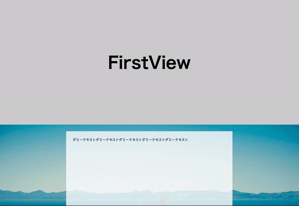
まずは画像とテキストを配置する
最初に画像とコンテンツを記述します。後述の「長方形で切り抜く」作業の関係でやや特殊な構造になります。
この時点での見た目はこんな感じ。
コードはこちら。
<!DOCTYPE html>
<html lang="ja">
  <head>
    <meta charset="UTF-8" />
    <meta http-equiv="X-UA-Compatible" content="IE=edge" />
    <meta name="viewport" content="width=device-width, initial-scale=1.0" />
    <title>Document</title>
    <link rel="stylesheet" href="./resources/styles/destyle.css" />
    <link rel="stylesheet" href="./resources/styles/style.css" />
  </head>
  <body>
    <div class="Firstview">FirstView</div>
    <section class="Section">
      <div class="Section__Inner">
        <div
          class="Section-Image"
          style="background-image: url(https://picsum.photos/id/10/2500/1667)"
        ></div>
        <div class="Section-Content">
          <div class="Section-Text">
            ダミーテキストダミーテキストダミーテキストダミーテキストダミーテキスト
          </div>
        </div>
      </div>
    </section>
    <section class="Section">
      <div class="Section__Inner">
        <div
          class="Section-Image"
          style="background-image: url(https://picsum.photos/id/1015/6000/4000)"
        ></div>
        <div class="Section-Content">
          <div class="Section-Text">
            ダミーテキストダミーテキストダミーテキストダミーテキストダミーテキスト
          </div>
        </div>
      </div>
    </section>
    <section class="Section">
      <div class="Section__Inner">
        <div
          class="Section-Image"
          style="background-image: url(https://picsum.photos/id/1029/4887/2759)"
        ></div>
        <div class="Section-Content">
          <div class="Section-Text">
            ダミーテキストダミーテキストダミーテキストダミーテキストダミーテキスト
          </div>
        </div>
      </div>
    </section>
    <section class="OtherSection"></section>
  </body>
</html>
.Firstview {
width: 100%;
height: 600px;
background-color: lightgray;
display: flex;
justify-content: center;
align-items: center;
font-size: 80px;
font-weight: bold;
}
.Section {
width: 100vw;
height: 100vh;
}
.Section__Inner {
position: relative;
width: 100%;
height: 100%;
}
.Section-Image {
position: absolute;
top: 0;
left: 0;
z-index: -1;
display: block;
width: 100vw;
height: 100vh;
background-size: cover;
background-position: center;
}
.Section-Content {
width: 100%;
height: 100%;
display: flex;
justify-content: center;
padding: 32px;
}
.Section-Text {
width: 100%;
max-width: 800px;
height: 100%;
padding: 32px;
background-color: rgba(255, 255, 255, 0.8);
}
.OtherSection {
width: 100%;
height: 600px;
background-color: lightgray;
}
.Sectionが各セクションのまとまりで、その中に「画像(.Section-Image)」と「コンテンツ部分(.Section-Content)」が配置されています。
.Section-Imageは単純な背景画像ではなく、positionを使って裏に配置しています。
また.Section__Innerという要素を一層挟んでいますが、後ほどこの要素が「長方形で切り抜く」要素になります。
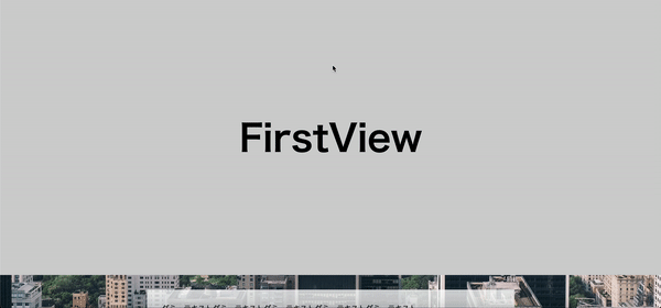
画像を全て固定(position: fixed)する
続いて、画像を固定します。background-attachment: fixed;はスクロールしても画像の位置が固定される挙動ですから、それを再現します。
この段階での見た目はこんな感じです。本来画像は3種類ありますが、fixedにすることで重なりが一番手前に来ている画像のみ見えます。
コードはこちら。
.Section-Image {
  position: fixed; /* fixedに変更する。それ以外は同じ。 */
  top: 0;
  left: 0;
  z-index: -1;
  display: block;
  width: 100vw;
  height: 100vh;
  background-size: cover;
  background-position: center;
}
長方形で切り抜く
さて、ここからがキモの部分です。「clip」というプロパティを使ってセクションごとに背景を切り抜きます。clip-pathというプロパティもありますが、ブラウザの対応状況の関係で古いほうのclipを使います。
注意点は、MDNにも書かれていますがposition:absoluteもしくはfixedの要素にしか効果がありません。

なので、まずは.Secction__Innerをabsoluteに変更します。
.Section {
  position: relative; /* positionをrelativeに変更。 */
  width: 100vw;
  height: 100vh;
}

.Section__Inner {
  position: absolute; /* positionをabsoluteに変更。 */
  top: 0; /* topを設定する。 */
  left: 0; /* leftを設定する。 */
  width: 100%;
  height: 100%;
}
そして.Section__Innerにclipを設定します。
.Section__Inner {
  position: absolute;
  top: 0;
  left: 0;
  width: 100%;
  height: 100%;
  clip: rect(auto, auto, auto, auto);
}
値はrect(<top>, <right>, <bottom>, <left>)という形式になっています。top/bottomは要素の上辺、left/rightは左辺からの距離になりますが、autoにすると要素の形で切り取られます。
これでbackground-attachment: fixed;の動きを再現できました。
まとめ
というわけで、background-attachment: fixed; をiOSでも動くように再現する方法でした。
パララックスでお困りの方はぜひお試しください。

コメント
[…] […]
[…] […]
[…] […]