
こんにちは。今回はスムーススクロールの作り方を徹底的に解説していきます。
ページ内リンク(アンカーリンク)やトップに戻るボタンを押した時に、パッと切り替わるよりはシューっとスクロールしていった方が見栄えがいいですからね。
この記事は僕が書いている5歳でも分かるシリーズの1つです。こちらにスライドショーやタブメニューなどの作り方も載っていますのでぜひご覧ください。
10/02追記
本シリーズはjQueryで解説をしておりますが、今後は基本的にVanilla JSなど別の方法で実装した方がベターかと思われます。→参考:https://itokoba.com/archives/4765
10/4追記
jQueryからVanilla JSに移行する際の手助けになるような情報をまとめた本をzennさんで出しました。ぜひお買い求めください。

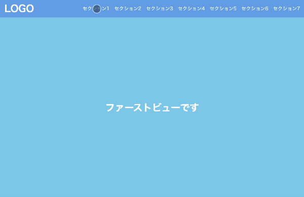
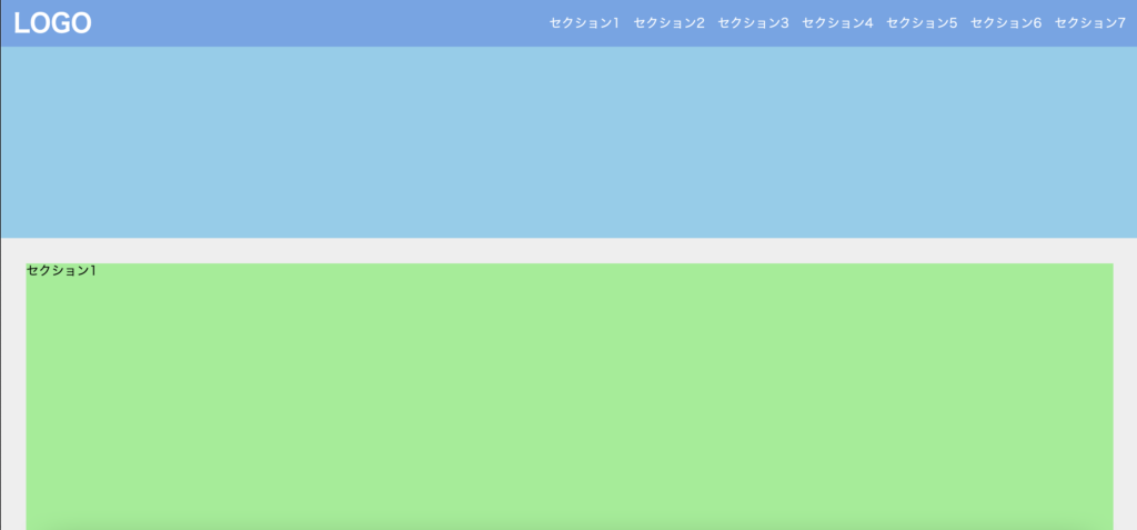
作るものの確認
今回作るのは、ページ内リンクなど通常のスクロール以外でスクロールが発生する際の動きを滑らかにするものです。
<!DOCTYPE html>
<html lang="ja">
  <head>
    <meta charset="UTF-8" />
    <meta http-equiv="X-UA-Compatible" content="IE=edge" />
    <meta name="viewport" content="width=device-width, initial-scale=1.0" />
    <title>Document</title>
    <link rel="stylesheet" href="./resources/styles/destyle.css" />
    <link rel="stylesheet" href="./resources/styles/style.css" />
  </head>
  <body>
    <header class="Header">
      <h1 class="Logo">LOGO</h1>
      <nav class="Navigation">
        <ul class="Menu">
          <li class="Menu-Item">
            <a href="#Section1" class="Menu-Item-Link">セクション1</a>
          </li>
          <li class="Menu-Item">
            <a href="#Section2" class="Menu-Item-Link">セクション2</a>
          </li>
          <li class="Menu-Item">
            <a href="#Section3" class="Menu-Item-Link">セクション3</a>
          </li>
          <li class="Menu-Item">
            <a href="#Section4" class="Menu-Item-Link">セクション4</a>
          </li>
          <li class="Menu-Item">
            <a href="#Section5" class="Menu-Item-Link">セクション5</a>
          </li>
          <li class="Menu-Item">
            <a href="#Section6" class="Menu-Item-Link">セクション6</a>
          </li>
          <li class="Menu-Item">
            <a href="#Section7" class="Menu-Item-Link">セクション7</a>
          </li>
        </ul>
      </nav>
    </header>
    <section class="FirstView">ファーストビューです</section>
    <main class="Main">
      <section id="Section1" class="Section">セクション1</section>
      <section id="Section2" class="Section">セクション2</section>
      <section id="Section3" class="Section">セクション3</section>
      <section id="Section4" class="Section">セクション4</section>
      <section id="Section5" class="Section">セクション5</section>
      <section id="Section6" class="Section">セクション6</section>
      <section id="Section7" class="Section">セクション7</section>
    </main>
    <script
      src="https://code.jquery.com/jquery-3.6.0.slim.min.js"
      integrity="sha256-u7e5khyithlIdTpu22PHhENmPcRdFiHRjhAuHcs05RI="
      crossorigin="anonymous"
    ></script>
    <script>
      $(".Menu-Item-Link").on("click", function (event) {
        event.preventDefault()
        const sectionId = $(this).attr("href")
        const sectionOffsetTop = $(sectionId).offset().top
        const HEADER_HEIGHT = 60
        window.scrollTo({
          top: sectionOffsetTop - HEADER_HEIGHT,
          behavior: "smooth",
        })
      })
    </script>
  </body>
</html>
body {
  width: 100%;
  padding-top: 60px;
}

.Header {
  position: fixed;
  top: 0;
  left: 0;
  width: 100%;
  height: 60px;
  padding-left: 16px;
  padding-right: 16px;
  background-color: #6ba6e7;
  display: flex;
  justify-content: space-between;
  align-items: center;
}

.Logo {
  color: #fff;
  font-size: 32px;
  font-weight: bold;
}

.Menu {
  display: flex;
  gap: 16px;
}

.Menu-Item {
  color: #fff;
}

.FirstView {
  width: 100%;
  height: calc(100vh - 60px);
  display: flex;
  justify-content: center;
  align-items: center;
  background-color: skyblue;
  color: #fff;
  font-weight: bold;
  font-size: 32px;
}

.Main {
  width: 100%;
  padding-top: 12px;
  padding-left: 32px;
  padding-right: 32px;
  padding-bottom: 32px;
  background-color: #eee;
}

.Section {
  margin-top: 20px;
  width: 100%;
  height: 400px;
  background-color: lightgreen;
}
実装
準備
コードを書き始める前に、ディレクトリ構成の確認とリセットCSSの導入です。
├── index.html
├── resources
└── styles
├── destyle.css
└── style.css
上記の形でファイルを配置しましょう。stylesはルートディレクトリ直下でも良いですが、実際にはresourcesの中にimagesフォルダなどと一緒に入っている形が多いのでそのようにしました。
destyle.cssというのがリセットCSSで、詳細な説明は省きますが各種タグに初期で当たっている様々な余計なスタイルを打ち消してくれるものです。
今回はこちら(https://github.com/nicolas-cusan/destyle.css/blob/master/destyle.css)のものを利用します。こちらのコードをそのままコピーしてdestyle.cssとして上記の場所に配置します。
/*! destyle.css v3.0.0 | MIT License | https://github.com/nicolas-cusan/destyle.css */

/* Reset box-model and set borders */
/* ============================================ */

*,
::before,
::after {
  box-sizing: border-box;
  border-style: solid;
  border-width: 0;
}

/* Document */
/* ============================================ */

/**
 * 1. Correct the line height in all browsers.
 * 2. Prevent adjustments of font size after orientation changes in iOS.
 * 3. Remove gray overlay on links for iOS.
 */

html {
  line-height: 1.15; /* 1 */
  -webkit-text-size-adjust: 100%; /* 2 */
  -webkit-tap-highlight-color: transparent; /* 3*/
}

/* Sections */
/* ============================================ */

/**
 * Remove the margin in all browsers.
 */

body {
  margin: 0;
}

/**
 * Render the `main` element consistently in IE.
 */

main {
  display: block;
}

/* Vertical rhythm */
/* ============================================ */

p,
table,
blockquote,
address,
pre,
iframe,
form,
figure,
dl {
  margin: 0;
}

/* Headings */
/* ============================================ */

h1,
h2,
h3,
h4,
h5,
h6 {
  font-size: inherit;
  font-weight: inherit;
  margin: 0;
}

/* Lists (enumeration) */
/* ============================================ */

ul,
ol {
  margin: 0;
  padding: 0;
  list-style: none;
}

/* Lists (definition) */
/* ============================================ */

dt {
  font-weight: bold;
}

dd {
  margin-left: 0;
}

/* Grouping content */
/* ============================================ */

/**
 * 1. Add the correct box sizing in Firefox.
 * 2. Show the overflow in Edge and IE.
 */

hr {
  box-sizing: content-box; /* 1 */
  height: 0; /* 1 */
  overflow: visible; /* 2 */
  border-top-width: 1px;
  margin: 0;
  clear: both;
  color: inherit;
}

/**
 * 1. Correct the inheritance and scaling of font size in all browsers.
 * 2. Correct the odd `em` font sizing in all browsers.
 */

pre {
  font-family: monospace, monospace; /* 1 */
  font-size: inherit; /* 2 */
}

address {
  font-style: inherit;
}

/* Text-level semantics */
/* ============================================ */

/**
 * Remove the gray background on active links in IE 10.
 */

a {
  background-color: transparent;
  text-decoration: none;
  color: inherit;
}

/**
 * 1. Remove the bottom border in Chrome 57-
 * 2. Add the correct text decoration in Chrome, Edge, IE, Opera, and Safari.
 */

abbr[title] {
  text-decoration: underline dotted; /* 2 */
}

/**
 * Add the correct font weight in Chrome, Edge, and Safari.
 */

b,
strong {
  font-weight: bolder;
}

/**
 * 1. Correct the inheritance and scaling of font size in all browsers.
 * 2. Correct the odd `em` font sizing in all browsers.
 */

code,
kbd,
samp {
  font-family: monospace, monospace; /* 1 */
  font-size: inherit; /* 2 */
}

/**
 * Add the correct font size in all browsers.
 */

small {
  font-size: 80%;
}

/**
 * Prevent `sub` and `sup` elements from affecting the line height in
 * all browsers.
 */

sub,
sup {
  font-size: 75%;
  line-height: 0;
  position: relative;
  vertical-align: baseline;
}

sub {
  bottom: -0.25em;
}

sup {
  top: -0.5em;
}

/* Replaced content */
/* ============================================ */

/**
 * Prevent vertical alignment issues.
 */

svg,
img,
embed,
object,
iframe {
  vertical-align: bottom;
}

/* Forms */
/* ============================================ */

/**
 * Reset form fields to make them styleable.
 * 1. Make form elements stylable across systems iOS especially.
 * 2. Inherit text-transform from parent.
 */

button,
input,
optgroup,
select,
textarea {
  -webkit-appearance: none; /* 1 */
  appearance: none;
  vertical-align: middle;
  color: inherit;
  font: inherit;
  background: transparent;
  padding: 0;
  margin: 0;
  border-radius: 0;
  text-align: inherit;
  text-transform: inherit; /* 2 */
}

/**
 * Reset radio and checkbox appearance to preserve their look in iOS.
 */

[type="checkbox"] {
  -webkit-appearance: checkbox;
  appearance: checkbox;
}

[type="radio"] {
  -webkit-appearance: radio;
  appearance: radio;
}

/**
 * Correct cursors for clickable elements.
 */

button,
[type="button"],
[type="reset"],
[type="submit"] {
  cursor: pointer;
}

button:disabled,
[type="button"]:disabled,
[type="reset"]:disabled,
[type="submit"]:disabled {
  cursor: default;
}

/**
 * Improve outlines for Firefox and unify style with input elements & buttons.
 */

:-moz-focusring {
  outline: auto;
}

select:disabled {
  opacity: inherit;
}

/**
 * Remove padding
 */

option {
  padding: 0;
}

/**
 * Reset to invisible
 */

fieldset {
  margin: 0;
  padding: 0;
  min-width: 0;
}

legend {
  padding: 0;
}

/**
 * Add the correct vertical alignment in Chrome, Firefox, and Opera.
 */

progress {
  vertical-align: baseline;
}

/**
 * Remove the default vertical scrollbar in IE 10+.
 */

textarea {
  overflow: auto;
}

/**
 * Correct the cursor style of increment and decrement buttons in Chrome.
 */

[type="number"]::-webkit-inner-spin-button,
[type="number"]::-webkit-outer-spin-button {
  height: auto;
}

/**
 * 1. Correct the outline style in Safari.
 */

[type="search"] {
  outline-offset: -2px; /* 1 */
}

/**
 * Remove the inner padding in Chrome and Safari on macOS.
 */

[type="search"]::-webkit-search-decoration {
  -webkit-appearance: none;
}

/**
 * 1. Correct the inability to style clickable types in iOS and Safari.
 * 2. Fix font inheritance.
 */

::-webkit-file-upload-button {
  -webkit-appearance: button; /* 1 */
  font: inherit; /* 2 */
}

/**
 * Clickable labels
 */

label[for] {
  cursor: pointer;
}

/* Interactive */
/* ============================================ */

/*
 * Add the correct display in Edge, IE 10+, and Firefox.
 */

details {
  display: block;
}

/*
 * Add the correct display in all browsers.
 */

summary {
  display: list-item;
}

/*
 * Remove outline for editable content.
 */

[contenteditable]:focus {
  outline: auto;
}

/* Tables */
/* ============================================ */

/**
1. Correct table border color inheritance in all Chrome and Safari.
*/

table {
  border-color: inherit; /* 1 */
}

caption {
  text-align: left;
}

td,
th {
  vertical-align: top;
  padding: 0;
}

th {
  text-align: left;
  font-weight: bold;
}
見た目を作る
まずは見た目を作りましょう。そんなに複雑ではないので一気に作ってしまいます。ヘッダーは固定にしておきます。
<!DOCTYPE html>
<html lang="ja">
  <head>
    <meta charset="UTF-8" />
    <meta http-equiv="X-UA-Compatible" content="IE=edge" />
    <meta name="viewport" content="width=device-width, initial-scale=1.0" />
    <title>Document</title>
    <link rel="stylesheet" href="./resources/styles/destyle.css" />
    <link rel="stylesheet" href="./resources/styles/style.css" />
  </head>
  <body>
    <header class="Header">
      <h1 class="Logo">LOGO</h1>
      <nav class="Navigation">
        <ul class="Menu">
          <li class="Menu-Item">
            <a href="#Section1" class="Menu-Item-Link">セクション1</a>
          </li>
          <li class="Menu-Item">
            <a href="#Section2" class="Menu-Item-Link">セクション2</a>
          </li>
          <li class="Menu-Item">
            <a href="#Section3" class="Menu-Item-Link">セクション3</a>
          </li>
          <li class="Menu-Item">
            <a href="#Section4" class="Menu-Item-Link">セクション4</a>
          </li>
          <li class="Menu-Item">
            <a href="#Section5" class="Menu-Item-Link">セクション5</a>
          </li>
          <li class="Menu-Item">
            <a href="#Section6" class="Menu-Item-Link">セクション6</a>
          </li>
          <li class="Menu-Item">
            <a href="#Section7" class="Menu-Item-Link">セクション7</a>
          </li>
        </ul>
      </nav>
    </header>
    <section class="FirstView">ファーストビューです</section>
    <main class="Main">
      <section id="Section1" class="Section">セクション1</section>
      <section id="Section2" class="Section">セクション2</section>
      <section id="Section3" class="Section">セクション3</section>
      <section id="Section4" class="Section">セクション4</section>
      <section id="Section5" class="Section">セクション5</section>
      <section id="Section6" class="Section">セクション6</section>
      <section id="Section7" class="Section">セクション7</section>
    </main>
  </body>
</html>
body {
  width: 100%;
  padding-top: 60px;
}

.Header {
  position: fixed;
  top: 0;
  left: 0;
  width: 100%;
  height: 60px;
  padding-left: 16px;
  padding-right: 16px;
  background-color: #6ba6e7;
  display: flex;
  justify-content: space-between;
  align-items: center;
}

.Logo {
  color: #fff;
  font-size: 32px;
  font-weight: bold;
}

.Menu {
  display: flex;
  gap: 16px;
}

.Menu-Item {
  color: #fff;
}

.FirstView {
  width: 100%;
  height: calc(100vh - 60px);
  display: flex;
  justify-content: center;
  align-items: center;
  background-color: skyblue;
  color: #fff;
  font-weight: bold;
  font-size: 32px;
}

.Main {
  width: 100%;
  padding-top: 12px;
  padding-left: 32px;
  padding-right: 32px;
  padding-bottom: 32px;
  background-color: #eee;
}

.Section {
  margin-top: 20px;
  width: 100%;
  height: 400px;
  background-color: lightgreen;
}
動きをつける
それでは動きを付けていきます。まずはjQueryを読み込みます。
<body>
  ...省略

  //追加
  <script
    src="https://code.jquery.com/jquery-3.6.0.slim.min.js"
    integrity="sha256-u7e5khyithlIdTpu22PHhENmPcRdFiHRjhAuHcs05RI="
    crossorigin="anonymous"
  ></script>

    <script>
    //ここにスムーススクロールのコードを追加していく
  </script>
</body>
続いてコード部分です。まずは、aタグのクリックした時の挙動を一旦止める必要があります。
<script>
  $(".Menu-Item-Link").on("click", function (event) {
    event.preventDefault()
  })
</script>
event.preventDefault()を実行することでデフォルトの動きを止めることができます。
続いてスクロールの処理です。
<script>
  $(".Menu-Item-Link").on("click", function (event) {
    event.preventDefault()

    //ここから追加
    const sectionId = $(this).attr("href")
    const sectionOffsetTop = $(sectionId).offset().top
    window.scrollTo({
      top: sectionOffsetTop,
      behavior: "smooth",
    })
  })
</script>
クリックした要素をthisを使って取得し、そのaタグのhrefの値を取得します。それに対応したセクションの位置をoffset()メソッドを用いて取得したら、その位置までscrollToメソッドで移動します。behavior: “smooth”を指定することにより滑らかにスクロールします。
さて、この状態でメニューをクリックしてみましょう。おっと、文字がヘッダーに隠れてしまいましたね。

ヘッダーの高さ分を考慮していなかったのでこのようになってしまいます。最後に調整をしましょう。
<script>
  $(".Menu-Item-Link").on("click", function (event) {
    event.preventDefault()
    const sectionId = $(this).attr("href")
    const sectionOffsetTop = $(sectionId).offset().top
    const HEADER_HEIGHT = 60 //追加
    window.scrollTo({
      top: sectionOffsetTop - HEADER_HEIGHT, //追加
      behavior: "smooth",
    })
  })
</script>
これで完成です!
まとめ
ということで、スムーススクロールの解説でした。
他にもいろんなパーツの解説をしていますので、ぜひご覧ください。
コメント