
こんにちは。今回はアコーディオンメニューの作り方を徹底的に解説していきます。
この記事は僕が書いている5歳でも分かるシリーズの1つです。こちらにスライドショーやタブメニューなどの作り方も載っていますのでぜひご覧ください。
「htmlはデータの構造」「cssはその見せ方を作るもの」「jsはクラスの付け替えによってその2つを操作するもの」と言う切り分け方を前提に、jQueryのaddClass/removeClass/toggleClassを用いた方法で実装します。
10/02追記
本シリーズはjQueryで解説をしておりますが、今後は基本的にVanilla JSなど別の方法で実装した方がベターかと思われます。→参考:https://itokoba.com/archives/4765
10/4追記
jQueryからVanilla JSに移行する際の手助けになるような情報をまとめた本をzennさんで出しました。ぜひお買い求めください。

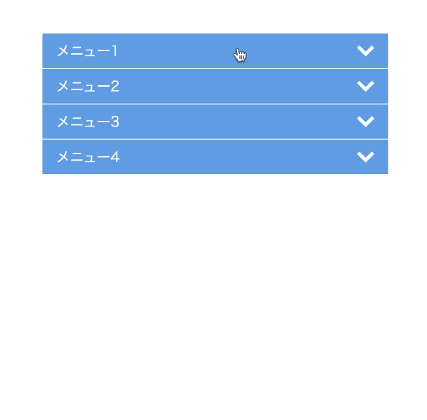
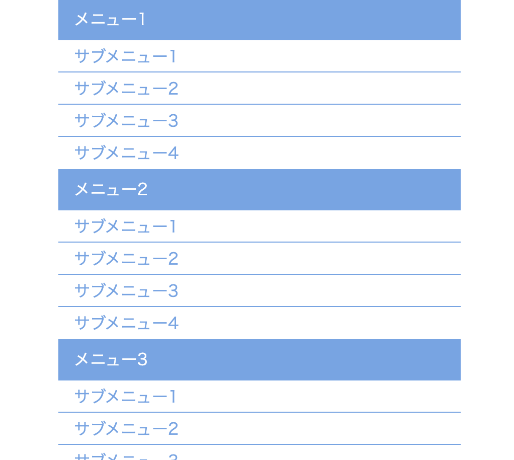
作るものの確認
メニューをクリックしたらサブメニューがさらに展開されるようなメニューです。
<!DOCTYPE html>
<html lang="ja">
  <head>
    <meta charset="UTF-8" />
    <meta http-equiv="X-UA-Compatible" content="IE=edge" />
    <meta name="viewport" content="width=device-width, initial-scale=1.0" />
    <title>Document</title>
    <link rel="stylesheet" href="./resources/styles/destyle.css" />
    <link rel="stylesheet" href="./resources/styles/style.css" />
  </head>
  <body>
    <nav class="AcordionMenu">
      <ul class="Menu">
        <li class="Menu-Item">
          <span class="Menu-Item-Label">メニュー1</span>
          <ul class="SubMenu">
            <li class="SubMenu-Item">
              <a href="./sample.html" class="SubMenu-Item-Link">
                サブメニュー1</a
              >
            </li>
            <li class="SubMenu-Item">
              <a href="./sample.html" class="SubMenu-Item-Link">
                サブメニュー2</a
              >
            </li>
            <li class="SubMenu-Item">
              <a href="./sample.html" class="SubMenu-Item-Link">
                サブメニュー3</a
              >
            </li>
            <li class="SubMenu-Item">
              <a href="./sample.html" class="SubMenu-Item-Link">
                サブメニュー4</a
              >
            </li>
          </ul>
        </li>
        <li class="Menu-Item">
          <span class="Menu-Item-Label">メニュー2</span>
          <ul class="SubMenu">
            <li class="SubMenu-Item">
              <a href="./sample.html" class="SubMenu-Item-Link">
                サブメニュー1</a
              >
            </li>
            <li class="SubMenu-Item">
              <a href="./sample.html" class="SubMenu-Item-Link">
                サブメニュー2</a
              >
            </li>
            <li class="SubMenu-Item">
              <a href="./sample.html" class="SubMenu-Item-Link">
                サブメニュー3</a
              >
            </li>
            <li class="SubMenu-Item">
              <a href="./sample.html" class="SubMenu-Item-Link">
                サブメニュー4</a
              >
            </li>
          </ul>
        </li>
        <li class="Menu-Item">
          <span class="Menu-Item-Label">メニュー3</span>
          <ul class="SubMenu">
            <li class="SubMenu-Item">
              <a href="./sample.html" class="SubMenu-Item-Link">
                サブメニュー1</a
              >
            </li>
            <li class="SubMenu-Item">
              <a href="./sample.html" class="SubMenu-Item-Link">
                サブメニュー2</a
              >
            </li>
            <li class="SubMenu-Item">
              <a href="./sample.html" class="SubMenu-Item-Link">
                サブメニュー3</a
              >
            </li>
            <li class="SubMenu-Item">
              <a href="./sample.html" class="SubMenu-Item-Link">
                サブメニュー4</a
              >
            </li>
          </ul>
        </li>
        <li class="Menu-Item">
          <span class="Menu-Item-Label">メニュー4</span>
          <ul class="SubMenu">
            <li class="SubMenu-Item">
              <a href="./sample.html" class="SubMenu-Item-Link">
                サブメニュー1</a
              >
            </li>
            <li class="SubMenu-Item">
              <a href="./sample.html" class="SubMenu-Item-Link">
                サブメニュー2</a
              >
            </li>
            <li class="SubMenu-Item">
              <a href="./sample.html" class="SubMenu-Item-Link">
                サブメニュー3</a
              >
            </li>
            <li class="SubMenu-Item">
              <a href="./sample.html" class="SubMenu-Item-Link">
                サブメニュー4</a
              >
            </li>
          </ul>
        </li>
      </ul>
    </nav>
    <script
      src="https://code.jquery.com/jquery-3.6.0.slim.min.js"
      integrity="sha256-u7e5khyithlIdTpu22PHhENmPcRdFiHRjhAuHcs05RI="
      crossorigin="anonymous"
    ></script>
    <script>
      const menuItemLabel = $(".Menu-Item-Label")
      menuItemLabel.on("click", function () {
        $(this).next().children().toggleClass("SubMenu-Item__isActive ")
      })
    </script>
  </body>
</html>
.AcordionMenu {
  margin-left: auto;
  margin-right: auto;
  width: 400px;
}

.Menu {
  width: 100%;
  background-color: #fff;
}

.Menu-Item {
  margin-bottom: 1px;
  width: 100%;
  background-color: #6ba6e7;
}

.Menu-Item-Label {
  width: 100%;
  height: 40px;
  padding-left: 16px;
  padding-right: 16px;
  display: flex;
  justify-content: space-between;
  align-items: center;
  color: #fff;
  cursor: pointer;
}

.Menu-Item-Label-Icon {
  width: 20px;
}

.SubMenu {
  width: 100%;
  background-color: #fff;
}

.SubMenu-Item {
  visibility: hidden;
  width: 100%;
  height: 0;
  display: flex;
  align-items: center;
  padding-left: 16px;
  padding-right: 16px;
  opacity: 0;
  transition: all 0.3s;
}

.SubMenu-Item__isActive {
  visibility: visible;
  border-top: 1px solid #6ba6e7;
  height: 32px;
  opacity: 1;
}

.SubMenu-Item-Link {
  color: #6ba6e7;
}
実装
準備
コードを書き始める前に、ディレクトリ構成の確認とリセットCSSの導入です。
├── index.html
├── resources
│ └── styles
│ ├── destyle.css
│ └── style.css
└── sample.html
上記の形でファイルを配置しましょう。stylesはルートディレクトリ直下でも良いですが、実際にはresourcesの中にimagesフォルダなどと一緒に入っている形が多いのでそのようにしました。またsample.htmlはメニューから遷移する用に一応用意しているだけのものなので、中身は適当で大丈夫です。
destyle.cssというのがリセットCSSで、詳細な説明は省きますが各種タグに初期で当たっている様々な余計なスタイルを打ち消してくれるものです。
今回はこちら(https://github.com/nicolas-cusan/destyle.css/blob/master/destyle.css)のものを利用します。こちらのコードをそのままコピーしてdestyle.cssとして上記の場所に配置します。
/*! destyle.css v3.0.0 | MIT License | https://github.com/nicolas-cusan/destyle.css */

/* Reset box-model and set borders */
/* ============================================ */

*,
::before,
::after {
  box-sizing: border-box;
  border-style: solid;
  border-width: 0;
}

/* Document */
/* ============================================ */

/**
 * 1. Correct the line height in all browsers.
 * 2. Prevent adjustments of font size after orientation changes in iOS.
 * 3. Remove gray overlay on links for iOS.
 */

html {
  line-height: 1.15; /* 1 */
  -webkit-text-size-adjust: 100%; /* 2 */
  -webkit-tap-highlight-color: transparent; /* 3*/
}

/* Sections */
/* ============================================ */

/**
 * Remove the margin in all browsers.
 */

body {
  margin: 0;
}

/**
 * Render the `main` element consistently in IE.
 */

main {
  display: block;
}

/* Vertical rhythm */
/* ============================================ */

p,
table,
blockquote,
address,
pre,
iframe,
form,
figure,
dl {
  margin: 0;
}

/* Headings */
/* ============================================ */

h1,
h2,
h3,
h4,
h5,
h6 {
  font-size: inherit;
  font-weight: inherit;
  margin: 0;
}

/* Lists (enumeration) */
/* ============================================ */

ul,
ol {
  margin: 0;
  padding: 0;
  list-style: none;
}

/* Lists (definition) */
/* ============================================ */

dt {
  font-weight: bold;
}

dd {
  margin-left: 0;
}

/* Grouping content */
/* ============================================ */

/**
 * 1. Add the correct box sizing in Firefox.
 * 2. Show the overflow in Edge and IE.
 */

hr {
  box-sizing: content-box; /* 1 */
  height: 0; /* 1 */
  overflow: visible; /* 2 */
  border-top-width: 1px;
  margin: 0;
  clear: both;
  color: inherit;
}

/**
 * 1. Correct the inheritance and scaling of font size in all browsers.
 * 2. Correct the odd `em` font sizing in all browsers.
 */

pre {
  font-family: monospace, monospace; /* 1 */
  font-size: inherit; /* 2 */
}

address {
  font-style: inherit;
}

/* Text-level semantics */
/* ============================================ */

/**
 * Remove the gray background on active links in IE 10.
 */

a {
  background-color: transparent;
  text-decoration: none;
  color: inherit;
}

/**
 * 1. Remove the bottom border in Chrome 57-
 * 2. Add the correct text decoration in Chrome, Edge, IE, Opera, and Safari.
 */

abbr[title] {
  text-decoration: underline dotted; /* 2 */
}

/**
 * Add the correct font weight in Chrome, Edge, and Safari.
 */

b,
strong {
  font-weight: bolder;
}

/**
 * 1. Correct the inheritance and scaling of font size in all browsers.
 * 2. Correct the odd `em` font sizing in all browsers.
 */

code,
kbd,
samp {
  font-family: monospace, monospace; /* 1 */
  font-size: inherit; /* 2 */
}

/**
 * Add the correct font size in all browsers.
 */

small {
  font-size: 80%;
}

/**
 * Prevent `sub` and `sup` elements from affecting the line height in
 * all browsers.
 */

sub,
sup {
  font-size: 75%;
  line-height: 0;
  position: relative;
  vertical-align: baseline;
}

sub {
  bottom: -0.25em;
}

sup {
  top: -0.5em;
}

/* Replaced content */
/* ============================================ */

/**
 * Prevent vertical alignment issues.
 */

svg,
img,
embed,
object,
iframe {
  vertical-align: bottom;
}

/* Forms */
/* ============================================ */

/**
 * Reset form fields to make them styleable.
 * 1. Make form elements stylable across systems iOS especially.
 * 2. Inherit text-transform from parent.
 */

button,
input,
optgroup,
select,
textarea {
  -webkit-appearance: none; /* 1 */
  appearance: none;
  vertical-align: middle;
  color: inherit;
  font: inherit;
  background: transparent;
  padding: 0;
  margin: 0;
  border-radius: 0;
  text-align: inherit;
  text-transform: inherit; /* 2 */
}

/**
 * Reset radio and checkbox appearance to preserve their look in iOS.
 */

[type="checkbox"] {
  -webkit-appearance: checkbox;
  appearance: checkbox;
}

[type="radio"] {
  -webkit-appearance: radio;
  appearance: radio;
}

/**
 * Correct cursors for clickable elements.
 */

button,
[type="button"],
[type="reset"],
[type="submit"] {
  cursor: pointer;
}

button:disabled,
[type="button"]:disabled,
[type="reset"]:disabled,
[type="submit"]:disabled {
  cursor: default;
}

/**
 * Improve outlines for Firefox and unify style with input elements & buttons.
 */

:-moz-focusring {
  outline: auto;
}

select:disabled {
  opacity: inherit;
}

/**
 * Remove padding
 */

option {
  padding: 0;
}

/**
 * Reset to invisible
 */

fieldset {
  margin: 0;
  padding: 0;
  min-width: 0;
}

legend {
  padding: 0;
}

/**
 * Add the correct vertical alignment in Chrome, Firefox, and Opera.
 */

progress {
  vertical-align: baseline;
}

/**
 * Remove the default vertical scrollbar in IE 10+.
 */

textarea {
  overflow: auto;
}

/**
 * Correct the cursor style of increment and decrement buttons in Chrome.
 */

[type="number"]::-webkit-inner-spin-button,
[type="number"]::-webkit-outer-spin-button {
  height: auto;
}

/**
 * 1. Correct the outline style in Safari.
 */

[type="search"] {
  outline-offset: -2px; /* 1 */
}

/**
 * Remove the inner padding in Chrome and Safari on macOS.
 */

[type="search"]::-webkit-search-decoration {
  -webkit-appearance: none;
}

/**
 * 1. Correct the inability to style clickable types in iOS and Safari.
 * 2. Fix font inheritance.
 */

::-webkit-file-upload-button {
  -webkit-appearance: button; /* 1 */
  font: inherit; /* 2 */
}

/**
 * Clickable labels
 */

label[for] {
  cursor: pointer;
}

/* Interactive */
/* ============================================ */

/*
 * Add the correct display in Edge, IE 10+, and Firefox.
 */

details {
  display: block;
}

/*
 * Add the correct display in all browsers.
 */

summary {
  display: list-item;
}

/*
 * Remove outline for editable content.
 */

[contenteditable]:focus {
  outline: auto;
}

/* Tables */
/* ============================================ */

/**
1. Correct table border color inheritance in all Chrome and Safari.
*/

table {
  border-color: inherit; /* 1 */
}

caption {
  text-align: left;
}

td,
th {
  vertical-align: top;
  padding: 0;
}

th {
  text-align: left;
  font-weight: bold;
}
見た目を作る
まずは見た目です。各メニューのなかにサブメニューが入る形です。
<!DOCTYPE html>
<html lang="ja">
  <head>
    <meta charset="UTF-8" />
    <meta http-equiv="X-UA-Compatible" content="IE=edge" />
    <meta name="viewport" content="width=device-width, initial-scale=1.0" />
    <title>Document</title>
    <link rel="stylesheet" href="./resources/styles/destyle.css" />
    <link rel="stylesheet" href="./resources/styles/style.css" />
  </head>
  <body>
    <nav class="AcordionMenu">
      <ul class="Menu">
        <li class="Menu-Item">
          <span class="Menu-Item-Label"
            >メニュー1<img
              class="Menu-Item-Label-Icon"
              src="./resources/images/down-arrow.svg"
              alt=""
          /></span>
          <ul class="SubMenu">
            <li class="SubMenu-Item">
              <a href="./sample.html" class="SubMenu-Item-Link">
                サブメニュー1</a
              >
            </li>
            <li class="SubMenu-Item">
              <a href="./sample.html" class="SubMenu-Item-Link">
                サブメニュー2</a
              >
            </li>
            <li class="SubMenu-Item">
              <a href="./sample.html" class="SubMenu-Item-Link">
                サブメニュー3</a
              >
            </li>
            <li class="SubMenu-Item">
              <a href="./sample.html" class="SubMenu-Item-Link">
                サブメニュー4</a
              >
            </li>
          </ul>
        </li>
        <li class="Menu-Item">
          <span class="Menu-Item-Label"
            >メニュー2<img
              class="Menu-Item-Label-Icon"
              src="./resources/images/down-arrow.svg"
              alt=""
          /></span>
          <ul class="SubMenu">
            <li class="SubMenu-Item">
              <a href="./sample.html" class="SubMenu-Item-Link">
                サブメニュー1</a
              >
            </li>
            <li class="SubMenu-Item">
              <a href="./sample.html" class="SubMenu-Item-Link">
                サブメニュー2</a
              >
            </li>
            <li class="SubMenu-Item">
              <a href="./sample.html" class="SubMenu-Item-Link">
                サブメニュー3</a
              >
            </li>
            <li class="SubMenu-Item">
              <a href="./sample.html" class="SubMenu-Item-Link">
                サブメニュー4</a
              >
            </li>
          </ul>
        </li>
        <li class="Menu-Item">
          <span class="Menu-Item-Label"
            >メニュー3<img
              class="Menu-Item-Label-Icon"
              src="./resources/images/down-arrow.svg"
              alt=""
          /></span>
          <ul class="SubMenu">
            <li class="SubMenu-Item">
              <a href="./sample.html" class="SubMenu-Item-Link">
                サブメニュー1</a
              >
            </li>
            <li class="SubMenu-Item">
              <a href="./sample.html" class="SubMenu-Item-Link">
                サブメニュー2</a
              >
            </li>
            <li class="SubMenu-Item">
              <a href="./sample.html" class="SubMenu-Item-Link">
                サブメニュー3</a
              >
            </li>
            <li class="SubMenu-Item">
              <a href="./sample.html" class="SubMenu-Item-Link">
                サブメニュー4</a
              >
            </li>
          </ul>
        </li>
        <li class="Menu-Item">
          <span class="Menu-Item-Label"
            >メニュー4<img
              class="Menu-Item-Label-Icon"
              src="./resources/images/down-arrow.svg"
              alt=""
          /></span>
          <ul class="SubMenu">
            <li class="SubMenu-Item">
              <a href="./sample.html" class="SubMenu-Item-Link">
                サブメニュー1</a
              >
            </li>
            <li class="SubMenu-Item">
              <a href="./sample.html" class="SubMenu-Item-Link">
                サブメニュー2</a
              >
            </li>
            <li class="SubMenu-Item">
              <a href="./sample.html" class="SubMenu-Item-Link">
                サブメニュー3</a
              >
            </li>
            <li class="SubMenu-Item">
              <a href="./sample.html" class="SubMenu-Item-Link">
                サブメニュー4</a
              >
            </li>
          </ul>
        </li>
      </ul>
    </nav>
  </body>
</html>
.AcordionMenu {
margin-left: auto;
margin-right: auto;
width: 400px;
}
.Menu {
width: 100%;
background-color: #fff;
}
.Menu-Item {
margin-bottom: 1px;
width: 100%;
background-color: #6ba6e7;
}
.Menu-Item-Label {
width: 100%;
height: 40px;
padding-left: 16px;
padding-right: 16px;
display: flex;
justify-content: space-between;
align-items: center;
color: #fff;
cursor: pointer;
}
.Menu-Item-Label-Icon {
width: 20px;
}
.SubMenu {
width: 100%;
background-color: #fff;
}
.SubMenu-Item {
border-top: 1px solid #6ba6e7;
width: 100%;
height: 32px;
display: flex;
align-items: center;
padding-left: 16px;
padding-right: 16px;
}
.SubMenu-Item-Link {
color: #6ba6e7;
}サブメニューはそれぞれ初期では非表示です。その指定をしておきましょう。
.SubMenu-Item {
  visibility: hidden; //追加
  /* border-top: 1px solid #6ba6e7; */ //ここは削除
  width: 100%;
  height: 0; //高さを0に変更
  display: flex;
  align-items: center;
  padding-left: 16px;
  padding-right: 16px;
  opacity: 0; //追加
}
このように、サブメニューの各要素の高さを0にしborderを削除しておきます。visibility: hidden;はdisplay: noneと違って元のレイアウトで確保されていた領域を保持します。今回の場合ではheightは0にしましたがborderの1px × 4つ分の合計4px分が余計な高さとして残ってしまうので削除する必要がありました。
このborderは後ほど用意するアクティブ時のクラスに配置し直します。
また、今回は.SubMenu-Itemに対してクラスの付け替えをすることにより表示させ、メニューの開閉を表現します。
動きをつける
最初に付け替える用のクラスの用意と、ついでにアニメーションの設定もします。
.SubMenu-Item {
  visibility: hidden;
  width: 100%;
  height: 0;
  display: flex;
  align-items: center;
  padding-left: 16px;
  padding-right: 16px;
  opacity: 0;
  transition: all 0.3s; //追加
}

.SubMenu-Item__isActive {
  visibility: visible;
  border-top: 1px solid #6ba6e7;
  height: 32px;
  opacity: 1;
}
高さを指定し、ボーダーも付けます。これによってメニューが開いたように見せることができます。またopacityの指定でふわっと開くアニメーションを実現します。
それでは動きを付けていきます。まずはjQueryを読み込みます。
<body>
  ...省略

  //追加
  <script
    src="https://code.jquery.com/jquery-3.6.0.slim.min.js"
    integrity="sha256-u7e5khyithlIdTpu22PHhENmPcRdFiHRjhAuHcs05RI="
    crossorigin="anonymous"
  ></script>

    <script>
    //ここにアコーディオンメニューのコードを追加していく
  </script>
</body>
続いてコード部分です。
<script>
  const menuItemLabel = $(".Menu-Item-Label")
  menuItemLabel.on("click", function () {
    $(this).next().children().toggleClass("SubMenu-Item__isActive ")
  })
</script>
クリックした要素から見て、サブメニューのアイテムを指定するために変わった記述をしています。
next()は隣り合っている次の要素、children()は子要素全てを表します。.Menu-Item-Labelから見ると、.SubMenuが隣り合っている次の要素、.SubMenu-Item全てがその子要素です。
<li class="Menu-Item">
  <span class="Menu-Item-Label">メニュー1</span> //ここが基準
  <ul class="SubMenu"> //隣り合っている次の要素
    <li class="SubMenu-Item">
      <a href="./sample.html" class="SubMenu-Item-Link">
        サブメニュー1</a
      >
    </li>
    <li class="SubMenu-Item"> //その子要素
      <a href="./sample.html" class="SubMenu-Item-Link">
        サブメニュー2</a
      >
    </li>
    <li class="SubMenu-Item"> //その子要素
      <a href="./sample.html" class="SubMenu-Item-Link">
        サブメニュー3</a
      >
    </li>
    <li class="SubMenu-Item"> //その子要素
      <a href="./sample.html" class="SubMenu-Item-Link">
        サブメニュー4</a
      >
    </li>
  </ul>
</li>
これで目的の要素のクラスを付け替えることができました。
これでアコーディオンメニューの完成です!
まとめ
ということで、アコーディオンメニューの解説でした。
他にもいろんなパーツの解説をしていますので、ぜひご覧ください。
コメント