
こんにちは。今回はスクロールアニメーションの作り方を徹底的に解説していきます。
この記事は僕が書いている5歳でも分かるシリーズの1つです。こちらにスライドショーやタブメニューなどの作り方も載っていますのでぜひご覧ください。
「htmlはデータの構造」「cssはその見せ方を作るもの」「jsはクラスの付け替えによってその2つを操作するもの」と言う切り分け方を前提に、jQueryのaddClass/removeClass/toggleClassを用いた方法で実装します。
10/02追記
本シリーズはjQueryで解説をしておりますが、今後は基本的にVanilla JSなど別の方法で実装した方がベターかと思われます。→参考:https://itokoba.com/archives/4765
10/4追記
jQueryからVanilla JSに移行する際の手助けになるような情報をまとめた本をzennさんで出しました。ぜひお買い求めください。

作るものの確認
今回作るのは、このようにスクロールに合わせて各セクションがふわっと表示されるようなアニメーションです。
コードは以下のものになりますので、何か困ったことが起きたらここのコードと見比べてみてください。(コピペでも使えます)
<!DOCTYPE html>
<html lang="ja">
<head>
<meta charset="UTF-8" />
<meta http-equiv="X-UA-Compatible" content="IE=edge" />
<meta name="viewport" content="width=device-width, initial-scale=1.0" />
<title>Document</title>
<link rel="stylesheet" href="./resources/styles/destyle.css" />
<link rel="stylesheet" href="./resources/styles/style.css" />
</head>
<body>
<header class="Header">
<h1 class="Logo">LOGO</h1>
</header>
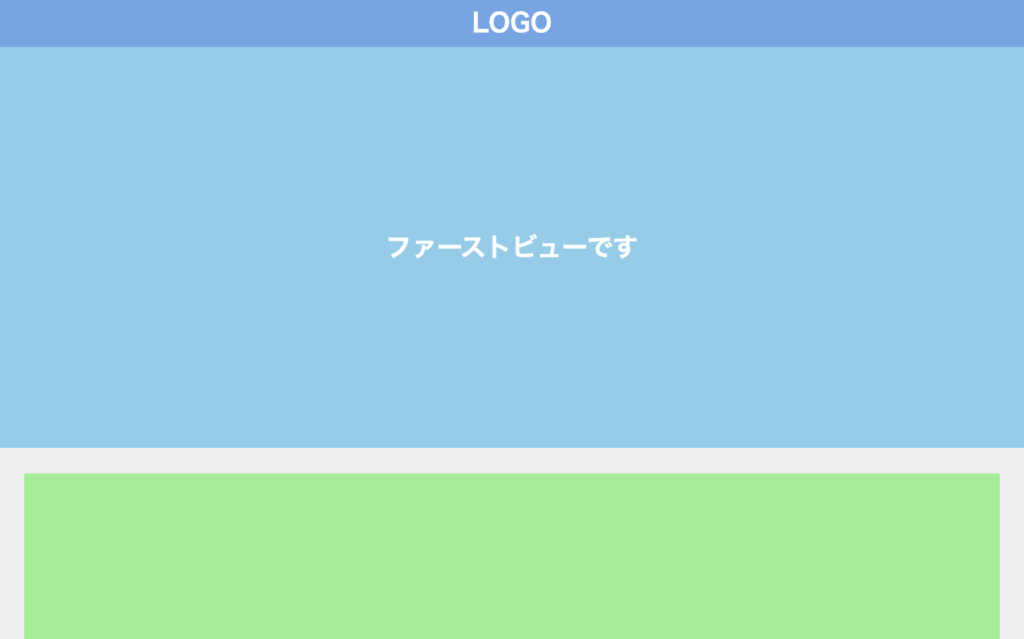
<section class="FirstView">ファーストビューです</section>
<main class="Main">
<section class="Section"></section>
<section class="Section"></section>
<section class="Section"></section>
<section class="Section"></section>
<section class="Section"></section>
<section class="Section"></section>
<section class="Section"></section>
</main>
<script
src="https://code.jquery.com/jquery-3.6.0.slim.min.js"
integrity="sha256-u7e5khyithlIdTpu22PHhENmPcRdFiHRjhAuHcs05RI="
crossorigin="anonymous"
></script>
<script>
const sections = $(".Section")
function animationByScroll() {
const scrollY = window.scrollY
const windowHeight = window.innerHeight
const INVIEW_HEIGHT = 200
sections.each(function (_, section) {
const offsetTop = section.offsetTop
if (scrollY + windowHeight > offsetTop + INVIEW_HEIGHT) {
$(section).addClass("Section__isActive")
}
})
}
window.onload = function () {
animationByScroll()
}
$(window).on("scroll", function () {
animationByScroll()
})
</script>
</body>
</html>
.Header {
  width: 100%;
  height: 60px;
  background-color: #6ba6e7;
  display: flex;
  justify-content: center;
  align-items: center;
}

.Logo {
  color: #fff;
  font-size: 32px;
  font-weight: bold;
}

.FirstView {
  width: 100%;
  height: calc(100vh - 60px);
  display: flex;
  justify-content: center;
  align-items: center;
  background-color: skyblue;
  color: #fff;
  font-weight: bold;
  font-size: 32px;
}

.Main {
  width: 100%;
  padding-top: 12px;
  padding-left: 32px;
  padding-right: 32px;
  padding-bottom: 32px;
  background-color: #eee;
}

.Section {
  visibility: hidden;
  margin-top: 20px;
  width: 100%;
  height: 400px;
  background-color: lightgreen;
  transition: all 0.3s;
  transform: translateY(100px);
  opacity: 0;
}

.Section__isActive {
  visibility: visible;
  transform: translateY(0);
  opacity: 1;
}
実装
準備
コードを書き始める前に、ディレクトリ構成の確認とリセットCSSの導入です。
├── index.html
├── resources
└── styles
├── destyle.css
└── style.css
上記の形でファイルを配置しましょう。stylesはルートディレクトリ直下でも良いですが、実際にはresourcesの中にimagesフォルダなどと一緒に入っている形が多いのでそのようにしました。
destyle.cssというのがリセットCSSで、詳細な説明は省きますが各種タグに初期で当たっている様々な余計なスタイルを打ち消してくれるものです。
今回はこちら(https://github.com/nicolas-cusan/destyle.css/blob/master/destyle.css)のものを利用します。こちらのコードをそのままコピーしてdestyle.cssとして上記の場所に配置します。
/*! destyle.css v3.0.0 | MIT License | https://github.com/nicolas-cusan/destyle.css */

/* Reset box-model and set borders */
/* ============================================ */

*,
::before,
::after {
  box-sizing: border-box;
  border-style: solid;
  border-width: 0;
}

/* Document */
/* ============================================ */

/**
 * 1. Correct the line height in all browsers.
 * 2. Prevent adjustments of font size after orientation changes in iOS.
 * 3. Remove gray overlay on links for iOS.
 */

html {
  line-height: 1.15; /* 1 */
  -webkit-text-size-adjust: 100%; /* 2 */
  -webkit-tap-highlight-color: transparent; /* 3*/
}

/* Sections */
/* ============================================ */

/**
 * Remove the margin in all browsers.
 */

body {
  margin: 0;
}

/**
 * Render the `main` element consistently in IE.
 */

main {
  display: block;
}

/* Vertical rhythm */
/* ============================================ */

p,
table,
blockquote,
address,
pre,
iframe,
form,
figure,
dl {
  margin: 0;
}

/* Headings */
/* ============================================ */

h1,
h2,
h3,
h4,
h5,
h6 {
  font-size: inherit;
  font-weight: inherit;
  margin: 0;
}

/* Lists (enumeration) */
/* ============================================ */

ul,
ol {
  margin: 0;
  padding: 0;
  list-style: none;
}

/* Lists (definition) */
/* ============================================ */

dt {
  font-weight: bold;
}

dd {
  margin-left: 0;
}

/* Grouping content */
/* ============================================ */

/**
 * 1. Add the correct box sizing in Firefox.
 * 2. Show the overflow in Edge and IE.
 */

hr {
  box-sizing: content-box; /* 1 */
  height: 0; /* 1 */
  overflow: visible; /* 2 */
  border-top-width: 1px;
  margin: 0;
  clear: both;
  color: inherit;
}

/**
 * 1. Correct the inheritance and scaling of font size in all browsers.
 * 2. Correct the odd `em` font sizing in all browsers.
 */

pre {
  font-family: monospace, monospace; /* 1 */
  font-size: inherit; /* 2 */
}

address {
  font-style: inherit;
}

/* Text-level semantics */
/* ============================================ */

/**
 * Remove the gray background on active links in IE 10.
 */

a {
  background-color: transparent;
  text-decoration: none;
  color: inherit;
}

/**
 * 1. Remove the bottom border in Chrome 57-
 * 2. Add the correct text decoration in Chrome, Edge, IE, Opera, and Safari.
 */

abbr[title] {
  text-decoration: underline dotted; /* 2 */
}

/**
 * Add the correct font weight in Chrome, Edge, and Safari.
 */

b,
strong {
  font-weight: bolder;
}

/**
 * 1. Correct the inheritance and scaling of font size in all browsers.
 * 2. Correct the odd `em` font sizing in all browsers.
 */

code,
kbd,
samp {
  font-family: monospace, monospace; /* 1 */
  font-size: inherit; /* 2 */
}

/**
 * Add the correct font size in all browsers.
 */

small {
  font-size: 80%;
}

/**
 * Prevent `sub` and `sup` elements from affecting the line height in
 * all browsers.
 */

sub,
sup {
  font-size: 75%;
  line-height: 0;
  position: relative;
  vertical-align: baseline;
}

sub {
  bottom: -0.25em;
}

sup {
  top: -0.5em;
}

/* Replaced content */
/* ============================================ */

/**
 * Prevent vertical alignment issues.
 */

svg,
img,
embed,
object,
iframe {
  vertical-align: bottom;
}

/* Forms */
/* ============================================ */

/**
 * Reset form fields to make them styleable.
 * 1. Make form elements stylable across systems iOS especially.
 * 2. Inherit text-transform from parent.
 */

button,
input,
optgroup,
select,
textarea {
  -webkit-appearance: none; /* 1 */
  appearance: none;
  vertical-align: middle;
  color: inherit;
  font: inherit;
  background: transparent;
  padding: 0;
  margin: 0;
  border-radius: 0;
  text-align: inherit;
  text-transform: inherit; /* 2 */
}

/**
 * Reset radio and checkbox appearance to preserve their look in iOS.
 */

[type="checkbox"] {
  -webkit-appearance: checkbox;
  appearance: checkbox;
}

[type="radio"] {
  -webkit-appearance: radio;
  appearance: radio;
}

/**
 * Correct cursors for clickable elements.
 */

button,
[type="button"],
[type="reset"],
[type="submit"] {
  cursor: pointer;
}

button:disabled,
[type="button"]:disabled,
[type="reset"]:disabled,
[type="submit"]:disabled {
  cursor: default;
}

/**
 * Improve outlines for Firefox and unify style with input elements & buttons.
 */

:-moz-focusring {
  outline: auto;
}

select:disabled {
  opacity: inherit;
}

/**
 * Remove padding
 */

option {
  padding: 0;
}

/**
 * Reset to invisible
 */

fieldset {
  margin: 0;
  padding: 0;
  min-width: 0;
}

legend {
  padding: 0;
}

/**
 * Add the correct vertical alignment in Chrome, Firefox, and Opera.
 */

progress {
  vertical-align: baseline;
}

/**
 * Remove the default vertical scrollbar in IE 10+.
 */

textarea {
  overflow: auto;
}

/**
 * Correct the cursor style of increment and decrement buttons in Chrome.
 */

[type="number"]::-webkit-inner-spin-button,
[type="number"]::-webkit-outer-spin-button {
  height: auto;
}

/**
 * 1. Correct the outline style in Safari.
 */

[type="search"] {
  outline-offset: -2px; /* 1 */
}

/**
 * Remove the inner padding in Chrome and Safari on macOS.
 */

[type="search"]::-webkit-search-decoration {
  -webkit-appearance: none;
}

/**
 * 1. Correct the inability to style clickable types in iOS and Safari.
 * 2. Fix font inheritance.
 */

::-webkit-file-upload-button {
  -webkit-appearance: button; /* 1 */
  font: inherit; /* 2 */
}

/**
 * Clickable labels
 */

label[for] {
  cursor: pointer;
}

/* Interactive */
/* ============================================ */

/*
 * Add the correct display in Edge, IE 10+, and Firefox.
 */

details {
  display: block;
}

/*
 * Add the correct display in all browsers.
 */

summary {
  display: list-item;
}

/*
 * Remove outline for editable content.
 */

[contenteditable]:focus {
  outline: auto;
}

/* Tables */
/* ============================================ */

/**
1. Correct table border color inheritance in all Chrome and Safari.
*/

table {
  border-color: inherit; /* 1 */
}

caption {
  text-align: left;
}

td,
th {
  vertical-align: top;
  padding: 0;
}

th {
  text-align: left;
  font-weight: bold;
}
見た目を作る
まずは見た目からです。
<!DOCTYPE html>
<html lang="ja">
  <head>
    <meta charset="UTF-8" />
    <meta http-equiv="X-UA-Compatible" content="IE=edge" />
    <meta name="viewport" content="width=device-width, initial-scale=1.0" />
    <title>Document</title>
    <link rel="stylesheet" href="./resources/styles/destyle.css" />
    <link rel="stylesheet" href="./resources/styles/style.css" />
  </head>
  <body>
    <header class="Header">
      <h1 class="Logo">LOGO</h1>
    </header>
    <section class="FirstView">ファーストビューです</section>
    <main class="Main">
      <section class="Section"></section>
      <section class="Section"></section>
      <section class="Section"></section>
      <section class="Section"></section>
      <section class="Section"></section>
      <section class="Section"></section>
      <section class="Section"></section>
    </main>
  </body>
</html>
.Header {
width: 100%;
height: 60px;
background-color: #6ba6e7;
display: flex;
justify-content: center;
align-items: center;
}
.Logo {
color: #fff;
font-size: 32px;
font-weight: bold;
}
.FirstView {
width: 100%;
height: calc(100vh - 60px);
display: flex;
justify-content: center;
align-items: center;
background-color: skyblue;
color: #fff;
font-weight: bold;
font-size: 32px;
}
.Main {
width: 100%;
padding-top: 12px;
padding-left: 32px;
padding-right: 32px;
padding-bottom: 32px;
background-color: #eee;
}
.Section {
margin-top: 20px;
width: 100%;
height: 400px;
background-color: lightgreen;
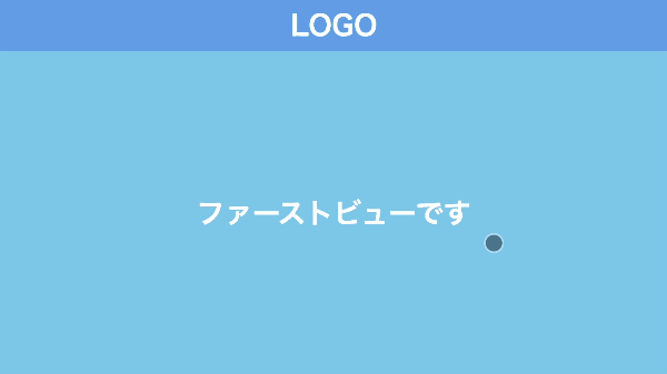
}ファーストビューは1画面分で、下にコンテンツが並んでいる形です。
コンテンツは初期状態では非表示なので、その指定をします。
.Section {
  visibility: hidden; //追加
  margin-top: 20px;
  width: 100%;
  height: 400px;
  background-color: lightgreen;
}
動きをつける
それでは、スクロールに合わせてコンテンツが表示されるようにしていきます。
まずはjQueryで付け替える用のクラスを用意しましょう。非表示になっているコンテンツを表示状態にしたいので、visibilityプロパティをvisibleに設定します。
.Section__isActive {
  visibility: visible;
}
続いて、jQueryでクラスの付け替えをしていきます。まずはjQueryを読み込みます。そして、その次の行からクラス付け替えのコードを実装します。
<body>
  ...省略

  //追加
  <script
    src="https://code.jquery.com/jquery-3.6.0.slim.min.js"
    integrity="sha256-u7e5khyithlIdTpu22PHhENmPcRdFiHRjhAuHcs05RI="
    crossorigin="anonymous"
  ></script>

    <script>
    //ここにクラス付け替えのコードを追加していく
  </script>
</body>
さて、「スクロールに合わせて」をどう表現するかを考えましょう。
直感的には「スクロールしていった時に、対象の要素が画面内に入る」ことが条件になりそうです。少し言い換えると、「対象の要素が画面内に入るくらいの量、スクロールした時」になります。
スクロールの量はwindow.scrollYというプロパティで取得することができます。では「対象の要素が画面内に入るくらいの量」がどのくらいなのか、ですね。
HTMLの要素は、実はそれぞれ色々な情報を持っています。その中に位置の情報があり、offsetTopとoffsetLeftという値で表現されます。基準点からどのくらい離れているかを示しており、基本的にはページの左上端が基準になります。
つまり、要素の縦方向の位置(offsetTop)以上にスクロールされたらクラスの付け替えをしてあげれば良さそうですね。
さて、ここで次の画像を見てください。
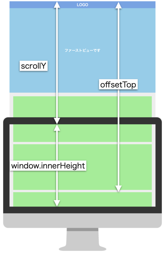
ScrollYとoffsetTopを単純に比較してしまうと、要素を最上部までスクロールしないとScrollY > offsetTopになりません。そこで画面の高さ分(window.innerHeight)を計算に入れてあげる必要があります。
これで条件式が書けそうですね。
したがって、各コンテンツ(.Section)に対して「scrollY + windowHeight > offsetTopが満たされた時、クラスを付け替える」という処理を書けば良いことになります。
<script>
  const sections = $(".Section")

  function animationByScroll() {
    const scrollY = window.scrollY //スクロール量
    const windowHeight = window.innerHeight //画面の高さ

    sections.each(function (_, section) {
      const offsetTop = section.offsetTop //要素の縦方向の位置

      if (scrollY + windowHeight > offsetTop) {
        $(section).addClass("Section__isActive")
      }
    })
  }

  $(window).on("scroll", function () {
    animationByScroll()
  })
</script>
sectionsに対して、eachメソッドを用いることで.Section1つ1つに対して設定を行うことが可能になります。
これでスクロールに合わせて要素を出現させることができるようになりました。
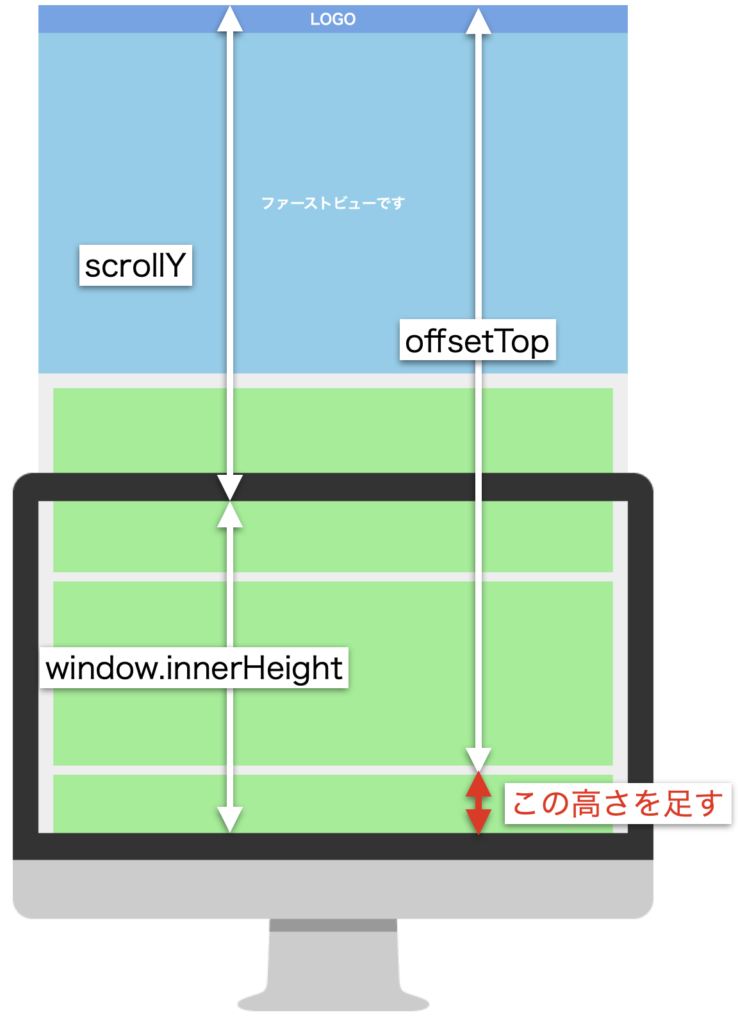
しかし、今の状態では要素が画面内に入った瞬間に表示されているのであまり効果がないですね(実際に試してみてください)。そこで数値を少しずらしましょう。offsetTopに、少しだけ高さを足します。
<script>
  const sections = $(".Section")

  function animationByScroll() {
    const scrollY = window.scrollY
    const windowHeight = window.innerHeight
    const INVIEW_HEIGHT = 200 //ずらす用の高さ

    sections.each(function (_, section) {
      const offsetTop = section.offsetTop

      if (scrollY + windowHeight > offsetTop + INVIEW_HEIGHT) { //ここに足す
        $(section).addClass("Section__isActive")
      }
    })
  }

  $(window).on("scroll", function () {
    animationByScroll()
  })
</script>
これで最低限の動きができました。
アニメーションさせる
最後にアニメーションをつけましょう。各セクションを下からふわっと動くようにします。そのために、最初の位置を下げておいてスクロール時に上に上がるような指定をします。
.Section {
  visibility: hidden;
  margin-top: 20px;
  width: 100%;
  height: 400px;
  background-color: lightgreen;
  transition: all 0.3s; //追加
  transform: translateY(100px); //追加
  opacity: 0; //追加
}

.Section__isActive {
  visibility: visible;
  transform: translateY(0); //追加
  opacity: 1; //追加
}
transkateYで初期位置を下げています。また、opacityの指定でふわっと出現させます。
最後の調整
最後に、細かい調整を行います。
ここまでのコードの状態で、一定以上スクロールしてからリロードするとアニメーションが動かない時があります。画像では点滅しているように見えてしまっていますが、リロードを繰り返しています。

これを防ぐために、画面読み込み時にもスクロールアニメーションの処理が動くようにする必要があります。
<script>
  const sections = $(".Section")

  function animationByScroll() {
    ...省略
  }

  //追加
  window.onload = function () {
    animationByScroll()
  }

  $(window).on("scroll", function () {
    animationByScroll()
  })
</script>
これで完成です!
まとめ
ということで、スクロールアニメーションの解説でした。
他にもいろんなパーツの解説をしていますので、ぜひご覧ください。
コメント