
こんにちは。今回はスライドショーの作り方を徹底的に解説していきます。スライドショーは、スライダーやカルーセルとも呼ばれたりしますね。
ここではSwiper.jsというライブラリを用いて作っていきます。
この記事は僕が書いている5歳でも分かるシリーズの1つです。他にもハンバーガーメニューやタブメニューなどの作り方も載っていますのでぜひご覧ください。
作るものの確認
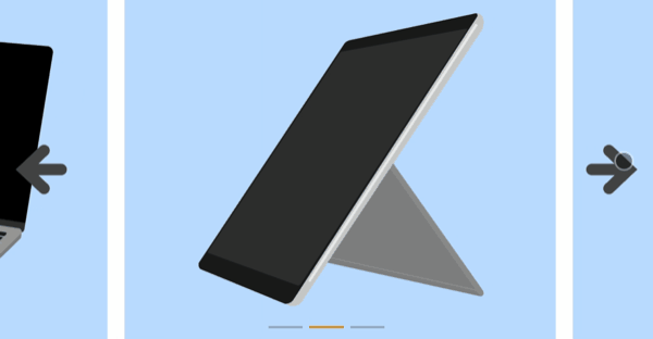
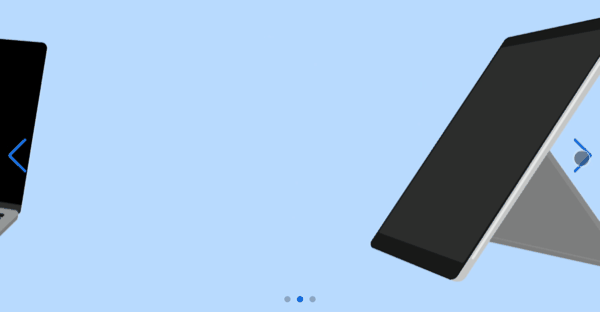
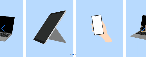
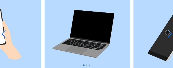
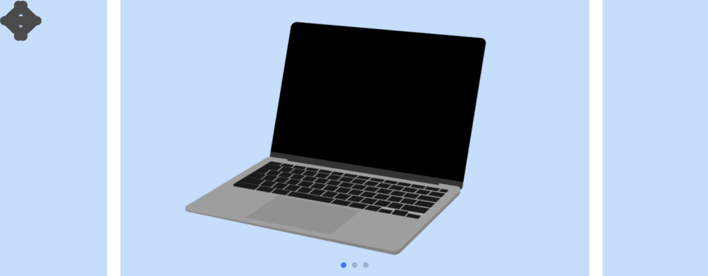
今回作るのは、このようなスライドショーです。ボタンや下部のページネーションを示すアイコン群もオリジナルなものにカスタマイズしていきます。
コードは以下のものになりますので、何か困ったことが起きたらここのコードと見比べてみてください。(コピペでも使えます)
<!DOCTYPE html>
<html lang="ja">
  <head>
    <meta charset="UTF-8" />
    <meta http-equiv="X-UA-Compatible" content="IE=edge" />
    <meta name="viewport" content="width=device-width, initial-scale=1.0" />
    <title>Document</title>
    <link rel="stylesheet" href="./resources/styles/destyle.css" />

    <!-- Swiperのスタイルシート -->
    <link
      rel="stylesheet"
      href="https://unpkg.com/swiper@7/swiper-bundle.min.css"
    />
    <link rel="stylesheet" href="./resources/styles/style.css" />
  </head>
  <body>
    <!-- Slider main container -->
    <div class="swiper">
      <!-- Additional required wrapper -->
      <div class="swiper-wrapper">
        <!-- Slides -->
        <div class="swiper-slide">
          <img
            src="./resources/images/pc.png"
            alt=""
            class="swiper-slide-image"
          />
        </div>
        <div class="swiper-slide">
          <img
            src="./resources/images/tab.png"
            alt=""
            class="swiper-slide-image"
          />
        </div>
        <div class="swiper-slide">
          <img
            src="./resources/images/sp.png"
            alt=""
            class="swiper-slide-image"
          />
        </div>
      </div>
      <!-- If we need pagination -->
      <div class="swiper-pagination"></div>

      <!-- If we need navigation buttons -->
      <div class="swiper-button-prev__origin">
        <img
          src="./resources/images/arrow_left.svg"
          alt=""
          class="swiper-button-prev-icon"
        />
      </div>
      <div class="swiper-button-next__origin">
        <img
          src="./resources/images/arrow_right.svg"
          alt=""
          class="swiper-button-prev-icon"
        />
      </div>
    </div>

    <script src="https://unpkg.com/swiper@7/swiper-bundle.min.js"></script>
    <script>
      const swiper = new Swiper(".swiper", {
        // Optional parameters
        loop: true,

        // If we need pagination
        pagination: {
          el: ".swiper-pagination",
        },

        // Navigation arrows
        navigation: {
          nextEl: ".swiper-button-next__origin",
          prevEl: ".swiper-button-prev__origin",
        },
        spaceBetween: 20,
        slidesPerView: 1.5,
        centeredSlides: true,
      })
    </script>
  </body>
</html>.swiper-slide {
height: 400px;
display: flex;
justify-content: center;
align-items: center;
background-color: #c0deff;
}
.swiper-slide-image {
width: 100%;
height: 100%;
object-fit: contain;
}
.swiper-button-prev__origin {
position: absolute;
top: 0;
bottom: 0;
left: 20px;
margin-top: auto;
margin-bottom: auto;
z-index: 10;
width: 60px;
height: 60px;
}
.swiper-button-next__origin {
position: absolute;
top: 0;
bottom: 0;
right: 20px;
margin-top: auto;
margin-bottom: auto;
z-index: 10;
width: 60px;
height: 60px;
}
.swiper-pagination-bullet {
border-radius: 0;
width: 40px;
height: 3px;
}
.swiper-pagination-bullet-active {
background-color: orange;
}
実装
準備
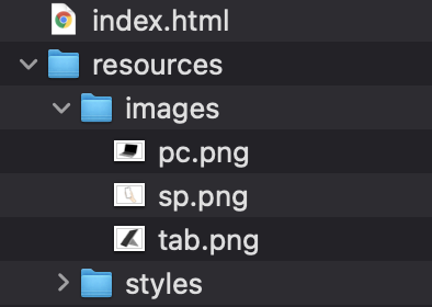
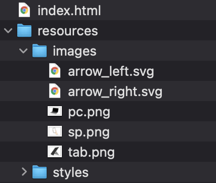
コードを書き始める前に、ディレクトリ構成の確認とリセットCSSの導入です。
├── index.html
└── resources
├── images
└── styles
├── destyle.css
└── style.css
上記の形でファイルを配置しましょう。画像は後ほど入れるのでimagesフォルダは空で大丈夫です。
destyle.cssというのがリセットCSSで、詳細な説明は省きますが各種タグに初期で当たっている様々な余計なスタイルを打ち消してくれるものです。
今回はこちら(https://github.com/nicolas-cusan/destyle.css/blob/master/destyle.css)のものを利用します。こちらのコードをそのままコピーしてdestyle.cssとして上記の場所に配置します。
/*! destyle.css v3.0.0 | MIT License | https://github.com/nicolas-cusan/destyle.css */

/* Reset box-model and set borders */
/* ============================================ */

*,
::before,
::after {
  box-sizing: border-box;
  border-style: solid;
  border-width: 0;
}

/* Document */
/* ============================================ */

/**
 * 1. Correct the line height in all browsers.
 * 2. Prevent adjustments of font size after orientation changes in iOS.
 * 3. Remove gray overlay on links for iOS.
 */

html {
  line-height: 1.15; /* 1 */
  -webkit-text-size-adjust: 100%; /* 2 */
  -webkit-tap-highlight-color: transparent; /* 3*/
}

/* Sections */
/* ============================================ */

/**
 * Remove the margin in all browsers.
 */

body {
  margin: 0;
}

/**
 * Render the `main` element consistently in IE.
 */

main {
  display: block;
}

/* Vertical rhythm */
/* ============================================ */

p,
table,
blockquote,
address,
pre,
iframe,
form,
figure,
dl {
  margin: 0;
}

/* Headings */
/* ============================================ */

h1,
h2,
h3,
h4,
h5,
h6 {
  font-size: inherit;
  font-weight: inherit;
  margin: 0;
}

/* Lists (enumeration) */
/* ============================================ */

ul,
ol {
  margin: 0;
  padding: 0;
  list-style: none;
}

/* Lists (definition) */
/* ============================================ */

dt {
  font-weight: bold;
}

dd {
  margin-left: 0;
}

/* Grouping content */
/* ============================================ */

/**
 * 1. Add the correct box sizing in Firefox.
 * 2. Show the overflow in Edge and IE.
 */

hr {
  box-sizing: content-box; /* 1 */
  height: 0; /* 1 */
  overflow: visible; /* 2 */
  border-top-width: 1px;
  margin: 0;
  clear: both;
  color: inherit;
}

/**
 * 1. Correct the inheritance and scaling of font size in all browsers.
 * 2. Correct the odd `em` font sizing in all browsers.
 */

pre {
  font-family: monospace, monospace; /* 1 */
  font-size: inherit; /* 2 */
}

address {
  font-style: inherit;
}

/* Text-level semantics */
/* ============================================ */

/**
 * Remove the gray background on active links in IE 10.
 */

a {
  background-color: transparent;
  text-decoration: none;
  color: inherit;
}

/**
 * 1. Remove the bottom border in Chrome 57-
 * 2. Add the correct text decoration in Chrome, Edge, IE, Opera, and Safari.
 */

abbr[title] {
  text-decoration: underline dotted; /* 2 */
}

/**
 * Add the correct font weight in Chrome, Edge, and Safari.
 */

b,
strong {
  font-weight: bolder;
}

/**
 * 1. Correct the inheritance and scaling of font size in all browsers.
 * 2. Correct the odd `em` font sizing in all browsers.
 */

code,
kbd,
samp {
  font-family: monospace, monospace; /* 1 */
  font-size: inherit; /* 2 */
}

/**
 * Add the correct font size in all browsers.
 */

small {
  font-size: 80%;
}

/**
 * Prevent `sub` and `sup` elements from affecting the line height in
 * all browsers.
 */

sub,
sup {
  font-size: 75%;
  line-height: 0;
  position: relative;
  vertical-align: baseline;
}

sub {
  bottom: -0.25em;
}

sup {
  top: -0.5em;
}

/* Replaced content */
/* ============================================ */

/**
 * Prevent vertical alignment issues.
 */

svg,
img,
embed,
object,
iframe {
  vertical-align: bottom;
}

/* Forms */
/* ============================================ */

/**
 * Reset form fields to make them styleable.
 * 1. Make form elements stylable across systems iOS especially.
 * 2. Inherit text-transform from parent.
 */

button,
input,
optgroup,
select,
textarea {
  -webkit-appearance: none; /* 1 */
  appearance: none;
  vertical-align: middle;
  color: inherit;
  font: inherit;
  background: transparent;
  padding: 0;
  margin: 0;
  border-radius: 0;
  text-align: inherit;
  text-transform: inherit; /* 2 */
}

/**
 * Reset radio and checkbox appearance to preserve their look in iOS.
 */

[type="checkbox"] {
  -webkit-appearance: checkbox;
  appearance: checkbox;
}

[type="radio"] {
  -webkit-appearance: radio;
  appearance: radio;
}

/**
 * Correct cursors for clickable elements.
 */

button,
[type="button"],
[type="reset"],
[type="submit"] {
  cursor: pointer;
}

button:disabled,
[type="button"]:disabled,
[type="reset"]:disabled,
[type="submit"]:disabled {
  cursor: default;
}

/**
 * Improve outlines for Firefox and unify style with input elements & buttons.
 */

:-moz-focusring {
  outline: auto;
}

select:disabled {
  opacity: inherit;
}

/**
 * Remove padding
 */

option {
  padding: 0;
}

/**
 * Reset to invisible
 */

fieldset {
  margin: 0;
  padding: 0;
  min-width: 0;
}

legend {
  padding: 0;
}

/**
 * Add the correct vertical alignment in Chrome, Firefox, and Opera.
 */

progress {
  vertical-align: baseline;
}

/**
 * Remove the default vertical scrollbar in IE 10+.
 */

textarea {
  overflow: auto;
}

/**
 * Correct the cursor style of increment and decrement buttons in Chrome.
 */

[type="number"]::-webkit-inner-spin-button,
[type="number"]::-webkit-outer-spin-button {
  height: auto;
}

/**
 * 1. Correct the outline style in Safari.
 */

[type="search"] {
  outline-offset: -2px; /* 1 */
}

/**
 * Remove the inner padding in Chrome and Safari on macOS.
 */

[type="search"]::-webkit-search-decoration {
  -webkit-appearance: none;
}

/**
 * 1. Correct the inability to style clickable types in iOS and Safari.
 * 2. Fix font inheritance.
 */

::-webkit-file-upload-button {
  -webkit-appearance: button; /* 1 */
  font: inherit; /* 2 */
}

/**
 * Clickable labels
 */

label[for] {
  cursor: pointer;
}

/* Interactive */
/* ============================================ */

/*
 * Add the correct display in Edge, IE 10+, and Firefox.
 */

details {
  display: block;
}

/*
 * Add the correct display in all browsers.
 */

summary {
  display: list-item;
}

/*
 * Remove outline for editable content.
 */

[contenteditable]:focus {
  outline: auto;
}

/* Tables */
/* ============================================ */

/**
1. Correct table border color inheritance in all Chrome and Safari.
*/

table {
  border-color: inherit; /* 1 */
}

caption {
  text-align: left;
}

td,
th {
  vertical-align: top;
  padding: 0;
}

th {
  text-align: left;
  font-weight: bold;
}
Swiper.jsを導入する
それではSwiper.jsを導入します。公式サイトのGetting Started(https://swiperjs.com/get-started)からHTMLのテンプレートとSwiper側で用意しているスタイルシート、そしてCDNで読み込むscript部分を導入します。
<!DOCTYPE html>
<html lang="ja">
  <head>
    <meta charset="UTF-8" />
    <meta http-equiv="X-UA-Compatible" content="IE=edge" />
    <meta name="viewport" content="width=device-width, initial-scale=1.0" />
    <title>Document</title>
    <link rel="stylesheet" href="./resources/styles/destyle.css" />

    <!-- Swiperのスタイルシート -->
    <link
      rel="stylesheet"
      href="https://unpkg.com/swiper@7/swiper-bundle.min.css"
    />
    <link rel="stylesheet" href="./resources/styles/style.css" />
  </head>
  <body>
    <!-- Slider main container -->
    <div class="swiper">
      <!-- Additional required wrapper -->
      <div class="swiper-wrapper">
        <!-- Slides -->
        <div class="swiper-slide">Slide 1</div>
        <div class="swiper-slide">Slide 2</div>
        <div class="swiper-slide">Slide 3</div>
        ...
      </div>
      <!-- If we need pagination -->
      <div class="swiper-pagination"></div>

      <!-- If we need navigation buttons -->
      <div class="swiper-button-prev"></div>
      <div class="swiper-button-next"></div>

      <!-- If we need scrollbar -->
      <div class="swiper-scrollbar"></div> <!-- ここは今回使わないので削除しても良い -->
    </div>

    <script src="https://unpkg.com/swiper@7/swiper-bundle.min.js"></script>
  </body>
</html>
headタグ内では、destyle.css、Swiperのスタイルシート、style.cssの順番で読み込みます。これは、基本的にcssは後から読み込まれたものが優先されるからです。最初に余計なスタイルを消し、Swiperデフォルトのスタイルを読み込んでから最後にオリジナルのスタイルを適用させるということです。
そして、Swiperを起動するためのコードを先ほど読み込んだscriptタグのさらに下に追加します。こちらも公式に書かれていますが、そのままでは使いにくいのでdirectionの設定とscrollbarの設定を省いています。
<script src="https://unpkg.com/swiper@7/swiper-bundle.min.js"></script>

<!-- ここから追加 -->
<script>
  const swiper = new Swiper(".swiper", {
    // Optional parameters
    loop: true,

    // If we need pagination
    pagination: {
      el: ".swiper-pagination",
    },

    // Navigation arrows
    navigation: {
      nextEl: ".swiper-button-next",
      prevEl: ".swiper-button-prev",
    },
  })
</script>
それでは、次の節で見た目を整えましょう。
スライドショーへ画像を挿入する
スライドショーに画像を入れていきます。何の画像でも良いですが、今回はillustACさんからお借りしました。
これらの画像をimagesフォルダの中にそれぞれpc.png、tab.png、sp.pngという名前で配置します。
続いてこれらを入れて、見た目を整えていきます。
<div class="swiper">
  <!-- Additional required wrapper -->
  <div class="swiper-wrapper">
    <!-- Slides -->
    <div class="swiper-slide">
      <img src="./resources/images/pc.png" alt="" class="swiper-slide-image" />
    </div>
    <div class="swiper-slide">
      <img src="./resources/images/tab.png" alt="" class="swiper-slide-image" />
    </div>
    <div class="swiper-slide">
      <img src="./resources/images/sp.png" alt="" class="swiper-slide-image" />
    </div>
  </div>
</div>
.swiper-slide {
height: 400px;
display: flex;
justify-content: center;
align-items: center;
background-color: #c0deff;
}
.swiper-slide-image {
width: 100%;
height: 100%;
object-fit: contain;
}画像のスタイルがやや特殊ですが、こうすると親要素のサイズによらず画像がはみ出なくなります。object-fitはbackground-sizeに似た挙動をし、同様にcontainやcoverのキーワードを用いることができます。object-fitについてはこちら(https://developer.mozilla.org/ja/docs/Web/CSS/object-fit)。
これで最低限のスライドショーが完成しました。
カスタマイズする
Swiper.jsに追加の設定をしてみる
Swiperには設定可能な項目がたくさんあります。どんな設定項目があるかは、公式のこちらのページ(https://swiperjs.com/swiper-api)に書かれています。
ここでは代表的なものを使って設定を変えてみましょう。
const swiper = new Swiper(".swiper", {

  ...省略

    navigation: {
    nextEl: ".swiper-button-next",
    prevEl: ".swiper-button-prev",
  },

  //ここから追加
  spaceBetween: 20,
  slidesPerView: 3,
})
spaceBetweenに数値を設定すると、その幅のmarginが作られます。そしてslidesPerViewに数値を設定するとその枚数分が1画面内に出現します。
また、slidesPerViewが偶数の時は画面を半分づつ埋める形になりますが、centeredSlides: trueを指定すれば中央揃えになります。
const swiper = new Swiper(".swiper", {
  ...省略

  spaceBetween: 20,
  slidesPerView: 2,
  centeredSlides: true,
})
さらに、slidesPerViewは整数以外の値も設定でき、今回のサンプルでは1.5にしています。
slidesPerView: 1.5,他にもautoplayという設定をすれば自動でスライドが切り替わったり、他にもさまざまな項目があるのでぜひ試してみてください。
オリジナルのボタン、ページネーションアイコンを作る
さて、最後にページ送りのボタンなどをオリジナルのものに差し替えていきましょう。
まずはボタンです。ボタンは最初のテンプレートでいうところの.swiper-button-prev(戻るボタン)と.swiper-button-next(進むボタン)です。これらにSwiperがデフォルトで指定しているスタイルを効かないようにするため、クラス名の後ろに__originをつけて変更します。
<div class="swiper-button-prev__origin"></div> //変更
<div class="swiper-button-next__origin"></div> //変更
そうしたら、scriptの方でもこのクラス名に変更します。
const swiper = new Swiper(".swiper", {
  ...省略

  // Navigation arrows
  navigation: {
    nextEl: ".swiper-button-next__origin",
    prevEl: ".swiper-button-prev__origin",
  },

  ...省略
})
こうすると一旦ボタンが見えなくなっていると思います。
ここに違うアイコンを入れてみましょう。アイコンはICOON MONOさんからお借りしました。それぞれをSVG形式でダウンロードしてください。
ダウンロードできたらそれぞれarrow_left.svg、arrow_right.svgと言う名前でimagesフォルダに配置します。
次に、画像をボタンの中に配置します。
<div class="swiper-button-prev__origin">
  <img
    src="./resources/images/arrow_left.svg"
    alt=""
    class="swiper-button-prev-icon"
  />
</div>
<div class="swiper-button-next__origin">
  <img
    src="./resources/images/arrow_right.svg"
    alt=""
    class="swiper-button-prev-icon"
  />
</div>
続いてスタイルです。
まずは見える状態にします。
.swiper-button-prev__origin {
  position: absolute;
  top: 0;
  z-index: 10;
  width: 60px;
  height: 60px;
}

.swiper-button-next__origin {
  position: absolute;
  top: 0;
  z-index: 10;
  width: 60px;
  height: 60px;
}
こうすると、画面左上に2つの矢印が重なって見えるかと思います。
このボタンをそれぞれ、縦方向には中央に配置し左端、右端に設置します。
.swiper-button-prev__origin {
  position: absolute;
  top: 0;
  bottom: 0; //追加
  left: 20px; //追加
  margin-top: auto; //追加
  margin-bottom: auto; //追加
  z-index: 10;
  width: 60px;
  height: 60px;
}

.swiper-button-next__origin {
  position: absolute;
  top: 0;
  bottom: 0; //追加
  right: 20px; //追加
  margin-top: auto; //追加
  margin-bottom: auto; //追加
  z-index: 10;
  width: 60px;
  height: 60px;
}
このように、topとbottomをそれぞれ0にした上でmargin-top/bottomをそれぞれautoにすると縦方向の中央に配置されます。(今回はしていませんが横方向も同様で、left/rightを0にした上でmargin-left/rightをautoにすると中央に配置されます。)
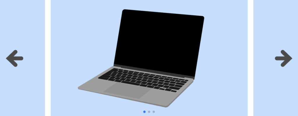
これでオリジナルのボタンを作ることができました。
次は下部のページネーションアイコンです。この要素をデベロッパーツールで見てみると、.swiper-pagination-bulletというクラスが付いていて、さらにアクティブなものには.swiper-pagination-bullet-activeが付いています。
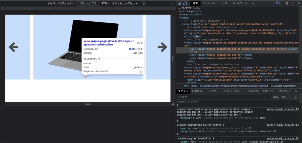
これらはSwiper.jsがJavaScriptから生成している要素なので、このクラス名に対してスタイルを上書きする形で見た目を変えていきます。
.swiper-pagination-bullet {
  border-radius: 0;
  width: 40px;
  height: 3px;
}

.swiper-pagination-bullet-active {
  background-color: orange;
}
円形はborder-radiusで実現されているので、それを打ち消します。そしてサイズを整えます。アクティブ状態の色はbackground-colorで実現されているので、それを別の色で上書きます。
これで完成です!
まとめ
というわけでスライドショーの作り方をなるべく細かく説明しました。世の中に公開されているライブラリには今回使ったSwiper.jsのようなものがいくつかあります。無闇やたらに使うとかえって複雑になるのでお勧めしませんが、数を絞って上手に使っていきましょう。

コメント