
こんにちは。今回はタブメニューを作る方法を徹底的に解説します。
この記事は僕が書いている5歳でも分かるシリーズの1つです。こちらにスライドショーやタブメニューなどの作り方も載っていますのでぜひご覧ください。
「htmlはデータの構造」「cssはその見せ方を作るもの」「jsはクラスの付け替えによってその2つを操作するもの」と言う切り分け方を前提に、jQueryのaddClass/removeClassを用いた方法で実装します。
また、初心者の方にわかりやすいよう説明を細かくしていきます。
10/02追記
本シリーズはjQueryで解説をしておりますが、今後は基本的にVanilla JSなど別の方法で実装した方がベターかと思われます。→参考:https://itokoba.com/archives/4765
10/4追記
jQueryからVanilla JSに移行する際の手助けになるような情報をまとめた本をzennさんで出しました。ぜひお買い求めください。

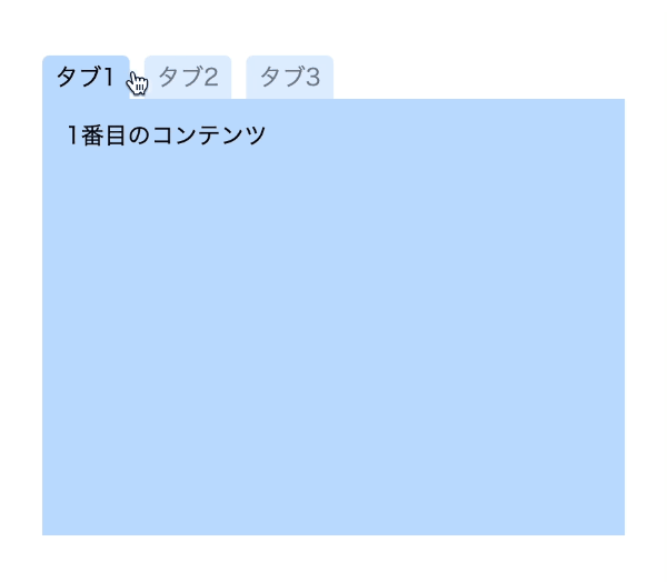
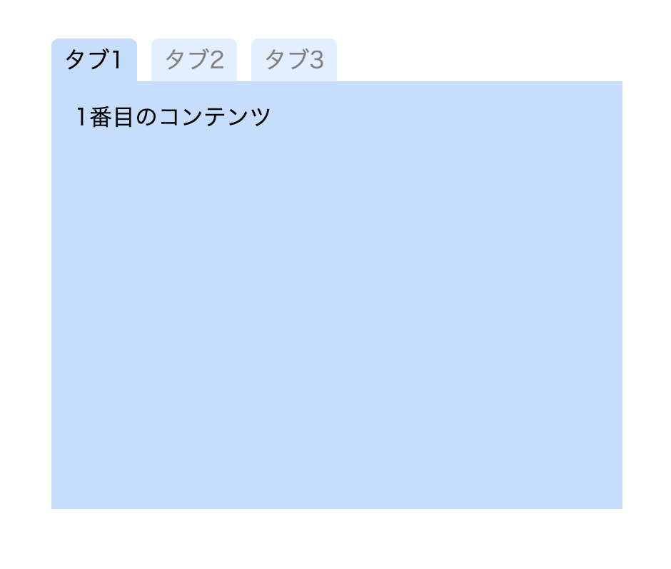
作るものの確認
今回作るのは、このようにボタンを押すと対応したコンテンツに切り替わるようなメニューです。
コードは以下のものになりますので、何か困ったことが起きたらここのコードと見比べてみてください。(コピペでも使えます)
<!DOCTYPE html>
<html lang="ja">
  <head>
    <meta charset="UTF-8" />
    <meta http-equiv="X-UA-Compatible" content="IE=edge" />
    <meta name="viewport" content="width=device-width, initial-scale=1.0" />
    <title>Document</title>
    <link rel="stylesheet" href="./resources/styles/destyle.css" />
    <link rel="stylesheet" href="./resources/styles/style.css" />
  </head>
  <body>
    <div class="TabMenu">
      <ul class="Tabs">
        <li data-id="Content1" class="Tab Tab__isActive">タブ1</li>
        <li data-id="Content2" class="Tab">タブ2</li>
        <li data-id="Content3" class="Tab">タブ3</li>
      </ul>
      <ul class="Contents">
        <li id="Content1" class="Content Content__isActive">
          1番目のコンテンツ
        </li>
        <li id="Content2" class="Content">2番目のコンテンツ</li>
        <li id="Content3" class="Content">3番目のコンテンツ</li>
      </ul>
    </div>
    <script
      src="https://code.jquery.com/jquery-3.6.0.slim.min.js"
      integrity="sha256-u7e5khyithlIdTpu22PHhENmPcRdFiHRjhAuHcs05RI="
      crossorigin="anonymous"
    ></script>
    <script>
      const tabs = $(".Tab")
      const contents = $(".Content")

      tabs.on("click", function () {
        tabs.removeClass("Tab__isActive")
        contents.removeClass("Content__isActive")

        const clickedTab = $(this)
        clickedTab.addClass("Tab__isActive")

        const id = "#" + clickedTab.data("id")
        $(id).addClass("Content__isActive")
      })
    </script>
  </body>
</html>.TabMenu {
margin-top: 100px;
margin-left: auto;
margin-right: auto;
width: 400px;
}
.Tabs {
width: 100%;
display: flex;
}
.Tab {
margin-right: 10px;
border-radius: 5px 5px 0 0;
width: 60px;
height: 30px;
display: flex;
justify-content: center;
align-items: center;
background-color: #c0deff;
opacity: 0.5;
cursor: pointer;
}
.Tab__isActive {
opacity: 1;
}
.Contents {
width: 100%;
}
.Content {
display: none;
width: 100%;
height: 300px;
padding: 16px;
background-color: #c0deff;
}
.Content__isActive {
display: block;
}
実装
準備
コードを書き始める前に、ディレクトリ構成の確認とリセットCSSの導入です。
├── index.html
├── resources
│ └── styles
│ ├── destyle.css
│ └── style.css
上記の形でファイルを配置しましょう。stylesはルートディレクトリ直下でも良いですが、実際にはresourcesの中にimagesフォルダなどと一緒に入っている形が多いのでそのようにしました。
destyle.cssというのがリセットCSSで、詳細な説明は省きますが各種タグに初期で当たっている様々な余計なスタイルを打ち消してくれるものです。
今回はこちら(https://github.com/nicolas-cusan/destyle.css/blob/master/destyle.css)のものを利用します。こちらのコードをそのままコピーしてdestyle.cssとして上記の場所に配置します。
/*! destyle.css v3.0.0 | MIT License | https://github.com/nicolas-cusan/destyle.css */

/* Reset box-model and set borders */
/* ============================================ */

*,
::before,
::after {
  box-sizing: border-box;
  border-style: solid;
  border-width: 0;
}

/* Document */
/* ============================================ */

/**
 * 1. Correct the line height in all browsers.
 * 2. Prevent adjustments of font size after orientation changes in iOS.
 * 3. Remove gray overlay on links for iOS.
 */

html {
  line-height: 1.15; /* 1 */
  -webkit-text-size-adjust: 100%; /* 2 */
  -webkit-tap-highlight-color: transparent; /* 3*/
}

/* Sections */
/* ============================================ */

/**
 * Remove the margin in all browsers.
 */

body {
  margin: 0;
}

/**
 * Render the `main` element consistently in IE.
 */

main {
  display: block;
}

/* Vertical rhythm */
/* ============================================ */

p,
table,
blockquote,
address,
pre,
iframe,
form,
figure,
dl {
  margin: 0;
}

/* Headings */
/* ============================================ */

h1,
h2,
h3,
h4,
h5,
h6 {
  font-size: inherit;
  font-weight: inherit;
  margin: 0;
}

/* Lists (enumeration) */
/* ============================================ */

ul,
ol {
  margin: 0;
  padding: 0;
  list-style: none;
}

/* Lists (definition) */
/* ============================================ */

dt {
  font-weight: bold;
}

dd {
  margin-left: 0;
}

/* Grouping content */
/* ============================================ */

/**
 * 1. Add the correct box sizing in Firefox.
 * 2. Show the overflow in Edge and IE.
 */

hr {
  box-sizing: content-box; /* 1 */
  height: 0; /* 1 */
  overflow: visible; /* 2 */
  border-top-width: 1px;
  margin: 0;
  clear: both;
  color: inherit;
}

/**
 * 1. Correct the inheritance and scaling of font size in all browsers.
 * 2. Correct the odd `em` font sizing in all browsers.
 */

pre {
  font-family: monospace, monospace; /* 1 */
  font-size: inherit; /* 2 */
}

address {
  font-style: inherit;
}

/* Text-level semantics */
/* ============================================ */

/**
 * Remove the gray background on active links in IE 10.
 */

a {
  background-color: transparent;
  text-decoration: none;
  color: inherit;
}

/**
 * 1. Remove the bottom border in Chrome 57-
 * 2. Add the correct text decoration in Chrome, Edge, IE, Opera, and Safari.
 */

abbr[title] {
  text-decoration: underline dotted; /* 2 */
}

/**
 * Add the correct font weight in Chrome, Edge, and Safari.
 */

b,
strong {
  font-weight: bolder;
}

/**
 * 1. Correct the inheritance and scaling of font size in all browsers.
 * 2. Correct the odd `em` font sizing in all browsers.
 */

code,
kbd,
samp {
  font-family: monospace, monospace; /* 1 */
  font-size: inherit; /* 2 */
}

/**
 * Add the correct font size in all browsers.
 */

small {
  font-size: 80%;
}

/**
 * Prevent `sub` and `sup` elements from affecting the line height in
 * all browsers.
 */

sub,
sup {
  font-size: 75%;
  line-height: 0;
  position: relative;
  vertical-align: baseline;
}

sub {
  bottom: -0.25em;
}

sup {
  top: -0.5em;
}

/* Replaced content */
/* ============================================ */

/**
 * Prevent vertical alignment issues.
 */

svg,
img,
embed,
object,
iframe {
  vertical-align: bottom;
}

/* Forms */
/* ============================================ */

/**
 * Reset form fields to make them styleable.
 * 1. Make form elements stylable across systems iOS especially.
 * 2. Inherit text-transform from parent.
 */

button,
input,
optgroup,
select,
textarea {
  -webkit-appearance: none; /* 1 */
  appearance: none;
  vertical-align: middle;
  color: inherit;
  font: inherit;
  background: transparent;
  padding: 0;
  margin: 0;
  border-radius: 0;
  text-align: inherit;
  text-transform: inherit; /* 2 */
}

/**
 * Reset radio and checkbox appearance to preserve their look in iOS.
 */

[type="checkbox"] {
  -webkit-appearance: checkbox;
  appearance: checkbox;
}

[type="radio"] {
  -webkit-appearance: radio;
  appearance: radio;
}

/**
 * Correct cursors for clickable elements.
 */

button,
[type="button"],
[type="reset"],
[type="submit"] {
  cursor: pointer;
}

button:disabled,
[type="button"]:disabled,
[type="reset"]:disabled,
[type="submit"]:disabled {
  cursor: default;
}

/**
 * Improve outlines for Firefox and unify style with input elements & buttons.
 */

:-moz-focusring {
  outline: auto;
}

select:disabled {
  opacity: inherit;
}

/**
 * Remove padding
 */

option {
  padding: 0;
}

/**
 * Reset to invisible
 */

fieldset {
  margin: 0;
  padding: 0;
  min-width: 0;
}

legend {
  padding: 0;
}

/**
 * Add the correct vertical alignment in Chrome, Firefox, and Opera.
 */

progress {
  vertical-align: baseline;
}

/**
 * Remove the default vertical scrollbar in IE 10+.
 */

textarea {
  overflow: auto;
}

/**
 * Correct the cursor style of increment and decrement buttons in Chrome.
 */

[type="number"]::-webkit-inner-spin-button,
[type="number"]::-webkit-outer-spin-button {
  height: auto;
}

/**
 * 1. Correct the outline style in Safari.
 */

[type="search"] {
  outline-offset: -2px; /* 1 */
}

/**
 * Remove the inner padding in Chrome and Safari on macOS.
 */

[type="search"]::-webkit-search-decoration {
  -webkit-appearance: none;
}

/**
 * 1. Correct the inability to style clickable types in iOS and Safari.
 * 2. Fix font inheritance.
 */

::-webkit-file-upload-button {
  -webkit-appearance: button; /* 1 */
  font: inherit; /* 2 */
}

/**
 * Clickable labels
 */

label[for] {
  cursor: pointer;
}

/* Interactive */
/* ============================================ */

/*
 * Add the correct display in Edge, IE 10+, and Firefox.
 */

details {
  display: block;
}

/*
 * Add the correct display in all browsers.
 */

summary {
  display: list-item;
}

/*
 * Remove outline for editable content.
 */

[contenteditable]:focus {
  outline: auto;
}

/* Tables */
/* ============================================ */

/**
1. Correct table border color inheritance in all Chrome and Safari.
*/

table {
  border-color: inherit; /* 1 */
}

caption {
  text-align: left;
}

td,
th {
  vertical-align: top;
  padding: 0;
}

th {
  text-align: left;
  font-weight: bold;
}
見た目を作る
まずは見た目です。そんなに複雑ではないので一気に作っていきます。
<!DOCTYPE html>
<html lang="ja">
  <head>
    <meta charset="UTF-8" />
    <meta http-equiv="X-UA-Compatible" content="IE=edge" />
    <meta name="viewport" content="width=device-width, initial-scale=1.0" />
    <title>Document</title>
    <link rel="stylesheet" href="./resources/styles/destyle.css" />
    <link rel="stylesheet" href="./resources/styles/style.css" />
  </head>
  <body>
    <div class="TabMenu">
      <ul class="Tabs">
        <li class="Tab Tab__isActive">タブ1</li>
        <li class="Tab">タブ2</li>
        <li class="Tab">タブ3</li>
      </ul>
      <ul class="Contents">
        <li class="Content Content__isActive">1番目のコンテンツ</li>
        <li class="Content">2番目のコンテンツ</li>
        <li class="Content">3番目のコンテンツ</li>
      </ul>
    </div>
  </body>
</html>
.TabMenu {
  margin-top: 100px;
  margin-left: auto;
  margin-right: auto;
  width: 400px;
}

.Tabs {
  width: 100%;
  display: flex;
}

.Tab {
  margin-right: 10px;
  border-radius: 5px 5px 0 0;
  width: 60px;
  height: 30px;
  display: flex;
  justify-content: center;
  align-items: center;
  background-color: #c0deff;
  opacity: 0.5; /* 最初は半透明 */
  cursor: pointer;
}

.Tab__isActive {
  opacity: 1; /* アクティブなものだけ強調 */
}

.Contents {
  width: 100%;
}

.Content {
  display: none; /* 最初は非表示 */
  width: 100%;
  height: 300px;
  padding: 16px;
  background-color: #c0deff;
}

.Content__isActive {
  display: block; /* アクティブなものだけ表示 */
}
.TabMenuのマージンはタブメニューを見やすい位置にしたかっただけなのでなくても良いです。
タブとコンテンツ部分は、それぞれアクティブなものだけ強調、表示される必要があります。そこで、.Tabクラスと.Contentクラスではそれぞれ半透明、非表示の状態で記述し、__isActiveと付いたクラスでアクティブな状態を分けて書きます。後でそのクラスをjQueryで付け替えることになります。
また、タブ部分はマウスカーソルを乗せた時にクリック可能であることがわかりやすいようにcursor: pointer;を指定しておきます。
タブとコンテンツを対応させる
タブ切り替えを実装する前に、どのタブを押したらどのコンテンツが表示されるのかを対応させる方法を紹介します。これには色々な方法がありますが、今回はdata属性を用いたものを使いましょう。
data属性とは、ある要素に対して意味のある情報を付加するために使われるものです。data-で始まるものは全てdata属性になります。詳細はこちら(https://developer.mozilla.org/ja/docs/Learn/HTML/Howto/Use_data_attributes)に書かれていますが、ちょっと複雑ですね。
とにかくやってみましょう。
<div class="TabMenu">
  <ul class="Tabs">
    <li data-id="Content1" class="Tab Tab__isActive">タブ1</li>
    <li data-id="Content2" class="Tab">タブ2</li>
    <li data-id="Content3" class="Tab">タブ3</li>
  </ul>
  <ul class="Contents">
    <li id="Content1" class="Content Content__isActive">
      1番目のコンテンツ
    </li>
    <li id="Content2" class="Content">2番目のコンテンツ</li>
    <li id="Content3" class="Content">3番目のコンテンツ</li>
  </ul>
</div>
このように、タブ側にdata-id属性を付与し、コンテンツ側にはid属性を付与します。そして中身をそれぞれ一致させます。これらを使ってjQueryから操作を行います。
動きをつける
それではクラスの付け替えをしていきます。まずはjQueryを読み込みます。bodyの一番下に書いてください。
また、その下にスクリプトを書いて行きます。
<body>
  ...省略

  <script
    src="https://code.jquery.com/jquery-3.6.0.slim.min.js"
    integrity="sha256-u7e5khyithlIdTpu22PHhENmPcRdFiHRjhAuHcs05RI="
    crossorigin="anonymous"
  ></script>

  <script>
    //ここに追加
  </script>
</body>
まずはタブをクリックした際に__isActiveと付いたクラスをタブとコンテンツからそれぞれ外します。
<script>
const tabs = $(".Tab")
const contents = $(".Content")
tabs.on("click", function () {
tabs.removeClass("Tab__isActive")
contents.removeClass("Content__isActive")
})
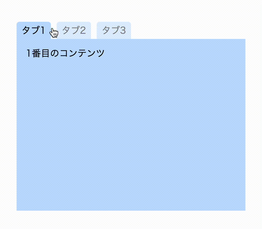
</script>この状態でクリックすると、タブが全て半透明になりコンテンツが一旦消えます(試してみてください)。
次に、クリックしたタブとそれに対応するコンテンツにクラスを付け直します。ここで先ほどのdata属性を用います。
<script>
  const tabs = $(".Tab")
  const contents = $(".Content")

  tabs.on("click", function () {
    tabs.removeClass("Tab__isActive")
    contents.removeClass("Content__isActive")

        //ここから追加
    const clickedTab = $(this) //クリックしたタブを取得
    clickedTab.addClass("Tab__isActive")

    const id = "#" + clickedTab.data("id") //data-idの値を取得し、#を頭につける
    $(id).addClass("Content__isActive") //対応したコンテンツにクラスを付与
  })
</script>
thisを使うことでクリックした要素を取得します。まずはそこにアクティブなクラスを付けます。
次にdata属性を使うのですが、data属性はjQueryのdataメソッドで取得することができます。data-に続く名前(今回はid)を引数に入れることでそのdata属性の値が取れます。タブ側でそれぞれContent1、Content2、Content3を設定していましたね。
そして、それに#を頭に付けて要素を指定すれば対応したコンテンツを指定できます。
これでタブの切り替えができるようになりました。完成です!
まとめ
というわけで今回はタブメニュを作りました。
data属性はあまり使ったことがないかもしれませんが、便利な機能なのでぜひ慣れてみてください。
コメント