
こんにちは。今回はドロップダウンメニューの作り方を徹底的に解説していきます。実はドロップダウンメニューはHTML/CSSのみで作れてしまうんです。
この記事は僕が書いている5歳でも分かるシリーズの1つです。こちらにスライドショーやタブメニューなどの作り方も載っていますのでぜひご覧ください。
作るものの確認
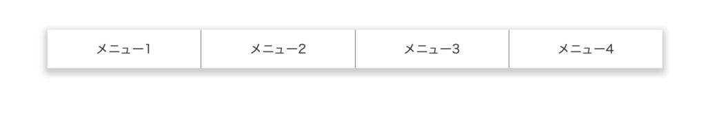
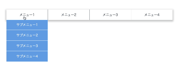
今回作るのは、このように各メニューにマウスオーバーをするとさらにメニュが展開されるドロップダウンメニューです。

コードは以下のものになりますので、何か困ったことが起きたらここのコードと見比べてみてください。(コピペでも使えます)
<!DOCTYPE html>
<html lang="ja">
  <head>
    <meta charset="UTF-8" />
    <meta http-equiv="X-UA-Compatible" content="IE=edge" />
    <meta name="viewport" content="width=device-width, initial-scale=1.0" />
    <title>Document</title>
    <link rel="stylesheet" href="./resources/styles/destyle.css" />
    <link rel="stylesheet" href="./resources/styles/style.css" />
  </head>
  <body>
    <nav class="DropdownMenu">
      <ul class="Menu">
        <li class="Menu-Item">
          <span class="Menu-Item-Label">メニュー1</span>
          <ul class="SubMenu">
            <li class="SubMenu-Item">
              <a href="./sample.html" class="SubMenu-Item-Link">
                サブメニュー1</a
              >
            </li>
            <li class="SubMenu-Item">
              <a href="./sample.html" class="SubMenu-Item-Link">
                サブメニュー2</a
              >
            </li>
            <li class="SubMenu-Item">
              <a href="./sample.html" class="SubMenu-Item-Link">
                サブメニュー3</a
              >
            </li>
            <li class="SubMenu-Item">
              <a href="./sample.html" class="SubMenu-Item-Link">
                サブメニュー4</a
              >
            </li>
          </ul>
        </li>
        <li class="Menu-Item">
          <span class="Menu-Item-Label">メニュー2</span>
          <ul class="SubMenu">
            <li class="SubMenu-Item">
              <a href="./sample.html" class="SubMenu-Item-Link">
                サブメニュー1</a
              >
            </li>
            <li class="SubMenu-Item">
              <a href="./sample.html" class="SubMenu-Item-Link">
                サブメニュー2</a
              >
            </li>
            <li class="SubMenu-Item">
              <a href="./sample.html" class="SubMenu-Item-Link">
                サブメニュー3</a
              >
            </li>
            <li class="SubMenu-Item">
              <a href="./sample.html" class="SubMenu-Item-Link">
                サブメニュー4</a
              >
            </li>
          </ul>
        </li>
        <li class="Menu-Item">
          <span class="Menu-Item-Label">メニュー3</span>
          <ul class="SubMenu">
            <li class="SubMenu-Item">
              <a href="./sample.html" class="SubMenu-Item-Link">
                サブメニュー1</a
              >
            </li>
            <li class="SubMenu-Item">
              <a href="./sample.html" class="SubMenu-Item-Link">
                サブメニュー2</a
              >
            </li>
            <li class="SubMenu-Item">
              <a href="./sample.html" class="SubMenu-Item-Link">
                サブメニュー3</a
              >
            </li>
            <li class="SubMenu-Item">
              <a href="./sample.html" class="SubMenu-Item-Link">
                サブメニュー4</a
              >
            </li>
          </ul>
        </li>
        <li class="Menu-Item">
          <span class="Menu-Item-Label">メニュー4</span>
          <ul class="SubMenu">
            <li class="SubMenu-Item">
              <a href="./sample.html" class="SubMenu-Item-Link">
                サブメニュー1</a
              >
            </li>
            <li class="SubMenu-Item">
              <a href="./sample.html" class="SubMenu-Item-Link">
                サブメニュー2</a
              >
            </li>
            <li class="SubMenu-Item">
              <a href="./sample.html" class="SubMenu-Item-Link">
                サブメニュー3</a
              >
            </li>
            <li class="SubMenu-Item">
              <a href="./sample.html" class="SubMenu-Item-Link">
                サブメニュー4</a
              >
            </li>
          </ul>
        </li>
      </ul>
    </nav>
  </body>
</html>.DropdownMenu {
margin-top: 100px;
margin-left: auto;
margin-right: auto;
width: 800px;
}
.Menu {
box-shadow: 0 4px 8px 4px rgba(0, 0, 0, 0.2);
width: 100%;
display: flex;
}
.Menu > * + * {
border-left: 1px solid #888;
}
.Menu-Item {
position: relative;
flex: 1;
cursor: pointer;
}
.Menu-Item-Label {
position: relative;
z-index: 10;
width: 100%;
height: 50px;
padding-top: 16px;
padding-bottom: 16px;
display: flex;
justify-content: center;
align-items: center;
background-color: #fff;
color: #333;
}
.SubMenu {
visibility: hidden;
position: absolute;
left: 0;
top: 40px;
width: 100%;
background-color: #6ba6e7;
}
.SubMenu-Item {
width: 100%;
padding: 16px;
display: flex;
justify-content: center;
align-items: center;
color: #fff;
}
.SubMenu > * + * {
border-top: 1px solid #fff;
}
.Menu-Item:hover .SubMenu {
transition: all 0.3s;
visibility: visible;
transform: translateY(10px);
}実装
準備
コードを書き始める前に、ディレクトリ構成の確認とリセットCSSの導入です。
├── index.html
├── resources
│ └── styles
│ ├── destyle.css
│ └── style.css
└── sample.html
上記の形でファイルを配置しましょう。stylesはルートディレクトリ直下でも良いですが、実際にはresourcesの中にimagesフォルダなどと一緒に入っている形が多いのでそのようにしました。またsample.htmlはメニューから遷移する用に一応用意しているだけのものなので、中身は適当で大丈夫です。
destyle.cssというのがリセットCSSで、詳細な説明は省きますが各種タグに初期で当たっている様々な余計なスタイルを打ち消してくれるものです。
今回はこちら(https://github.com/nicolas-cusan/destyle.css/blob/master/destyle.css)のものを利用します。こちらのコードをそのままコピーしてdestyle.cssとして上記の場所に配置します。
/*! destyle.css v3.0.0 | MIT License | https://github.com/nicolas-cusan/destyle.css */

/* Reset box-model and set borders */
/* ============================================ */

*,
::before,
::after {
  box-sizing: border-box;
  border-style: solid;
  border-width: 0;
}

/* Document */
/* ============================================ */

/**
 * 1. Correct the line height in all browsers.
 * 2. Prevent adjustments of font size after orientation changes in iOS.
 * 3. Remove gray overlay on links for iOS.
 */

html {
  line-height: 1.15; /* 1 */
  -webkit-text-size-adjust: 100%; /* 2 */
  -webkit-tap-highlight-color: transparent; /* 3*/
}

/* Sections */
/* ============================================ */

/**
 * Remove the margin in all browsers.
 */

body {
  margin: 0;
}

/**
 * Render the `main` element consistently in IE.
 */

main {
  display: block;
}

/* Vertical rhythm */
/* ============================================ */

p,
table,
blockquote,
address,
pre,
iframe,
form,
figure,
dl {
  margin: 0;
}

/* Headings */
/* ============================================ */

h1,
h2,
h3,
h4,
h5,
h6 {
  font-size: inherit;
  font-weight: inherit;
  margin: 0;
}

/* Lists (enumeration) */
/* ============================================ */

ul,
ol {
  margin: 0;
  padding: 0;
  list-style: none;
}

/* Lists (definition) */
/* ============================================ */

dt {
  font-weight: bold;
}

dd {
  margin-left: 0;
}

/* Grouping content */
/* ============================================ */

/**
 * 1. Add the correct box sizing in Firefox.
 * 2. Show the overflow in Edge and IE.
 */

hr {
  box-sizing: content-box; /* 1 */
  height: 0; /* 1 */
  overflow: visible; /* 2 */
  border-top-width: 1px;
  margin: 0;
  clear: both;
  color: inherit;
}

/**
 * 1. Correct the inheritance and scaling of font size in all browsers.
 * 2. Correct the odd `em` font sizing in all browsers.
 */

pre {
  font-family: monospace, monospace; /* 1 */
  font-size: inherit; /* 2 */
}

address {
  font-style: inherit;
}

/* Text-level semantics */
/* ============================================ */

/**
 * Remove the gray background on active links in IE 10.
 */

a {
  background-color: transparent;
  text-decoration: none;
  color: inherit;
}

/**
 * 1. Remove the bottom border in Chrome 57-
 * 2. Add the correct text decoration in Chrome, Edge, IE, Opera, and Safari.
 */

abbr[title] {
  text-decoration: underline dotted; /* 2 */
}

/**
 * Add the correct font weight in Chrome, Edge, and Safari.
 */

b,
strong {
  font-weight: bolder;
}

/**
 * 1. Correct the inheritance and scaling of font size in all browsers.
 * 2. Correct the odd `em` font sizing in all browsers.
 */

code,
kbd,
samp {
  font-family: monospace, monospace; /* 1 */
  font-size: inherit; /* 2 */
}

/**
 * Add the correct font size in all browsers.
 */

small {
  font-size: 80%;
}

/**
 * Prevent `sub` and `sup` elements from affecting the line height in
 * all browsers.
 */

sub,
sup {
  font-size: 75%;
  line-height: 0;
  position: relative;
  vertical-align: baseline;
}

sub {
  bottom: -0.25em;
}

sup {
  top: -0.5em;
}

/* Replaced content */
/* ============================================ */

/**
 * Prevent vertical alignment issues.
 */

svg,
img,
embed,
object,
iframe {
  vertical-align: bottom;
}

/* Forms */
/* ============================================ */

/**
 * Reset form fields to make them styleable.
 * 1. Make form elements stylable across systems iOS especially.
 * 2. Inherit text-transform from parent.
 */

button,
input,
optgroup,
select,
textarea {
  -webkit-appearance: none; /* 1 */
  appearance: none;
  vertical-align: middle;
  color: inherit;
  font: inherit;
  background: transparent;
  padding: 0;
  margin: 0;
  border-radius: 0;
  text-align: inherit;
  text-transform: inherit; /* 2 */
}

/**
 * Reset radio and checkbox appearance to preserve their look in iOS.
 */

[type="checkbox"] {
  -webkit-appearance: checkbox;
  appearance: checkbox;
}

[type="radio"] {
  -webkit-appearance: radio;
  appearance: radio;
}

/**
 * Correct cursors for clickable elements.
 */

button,
[type="button"],
[type="reset"],
[type="submit"] {
  cursor: pointer;
}

button:disabled,
[type="button"]:disabled,
[type="reset"]:disabled,
[type="submit"]:disabled {
  cursor: default;
}

/**
 * Improve outlines for Firefox and unify style with input elements & buttons.
 */

:-moz-focusring {
  outline: auto;
}

select:disabled {
  opacity: inherit;
}

/**
 * Remove padding
 */

option {
  padding: 0;
}

/**
 * Reset to invisible
 */

fieldset {
  margin: 0;
  padding: 0;
  min-width: 0;
}

legend {
  padding: 0;
}

/**
 * Add the correct vertical alignment in Chrome, Firefox, and Opera.
 */

progress {
  vertical-align: baseline;
}

/**
 * Remove the default vertical scrollbar in IE 10+.
 */

textarea {
  overflow: auto;
}

/**
 * Correct the cursor style of increment and decrement buttons in Chrome.
 */

[type="number"]::-webkit-inner-spin-button,
[type="number"]::-webkit-outer-spin-button {
  height: auto;
}

/**
 * 1. Correct the outline style in Safari.
 */

[type="search"] {
  outline-offset: -2px; /* 1 */
}

/**
 * Remove the inner padding in Chrome and Safari on macOS.
 */

[type="search"]::-webkit-search-decoration {
  -webkit-appearance: none;
}

/**
 * 1. Correct the inability to style clickable types in iOS and Safari.
 * 2. Fix font inheritance.
 */

::-webkit-file-upload-button {
  -webkit-appearance: button; /* 1 */
  font: inherit; /* 2 */
}

/**
 * Clickable labels
 */

label[for] {
  cursor: pointer;
}

/* Interactive */
/* ============================================ */

/*
 * Add the correct display in Edge, IE 10+, and Firefox.
 */

details {
  display: block;
}

/*
 * Add the correct display in all browsers.
 */

summary {
  display: list-item;
}

/*
 * Remove outline for editable content.
 */

[contenteditable]:focus {
  outline: auto;
}

/* Tables */
/* ============================================ */

/**
1. Correct table border color inheritance in all Chrome and Safari.
*/

table {
  border-color: inherit; /* 1 */
}

caption {
  text-align: left;
}

td,
th {
  vertical-align: top;
  padding: 0;
}

th {
  text-align: left;
  font-weight: bold;
}
見た目を作る
それでは見た目を作っていきます。大枠のメニューと展開されるメニュー(サブメニュー)を順番に作ります。
<!DOCTYPE html>
<html lang="ja">
  <head>
    <meta charset="UTF-8" />
    <meta http-equiv="X-UA-Compatible" content="IE=edge" />
    <meta name="viewport" content="width=device-width, initial-scale=1.0" />
    <title>Document</title>
    <link rel="stylesheet" href="./resources/styles/destyle.css" />
    <link rel="stylesheet" href="./resources/styles/style.css" />
  </head>
  <body>
    <nav class="DropdownMenu">
      <ul class="Menu">
        <li class="Menu-Item">
          <span class="Menu-Item-Label">メニュー1</span>
        </li>
        <li class="Menu-Item">
          <span class="Menu-Item-Label">メニュー2</span>
        </li>
        <li class="Menu-Item">
          <span class="Menu-Item-Label">メニュー3</span>
        </li>
        <li class="Menu-Item">
          <span class="Menu-Item-Label">メニュー4</span>
        </li>
      </ul>
    </nav>
  </body>
</html>
.DropdownMenu {
margin-top: 100px;
margin-left: auto;
margin-right: auto;
width: 800px;
}
.Menu {
box-shadow: 0 4px 8px 4px rgba(0, 0, 0, 0.2);
width: 100%;
display: flex;
}
.Menu > * + * {
border-left: 1px solid #888;
}
.Menu-Item {
flex: 1;
cursor: pointer;
}
.Menu-Item-Label {
width: 100%;
height: 50px;
padding-top: 16px;
padding-bottom: 16px;
display: flex;
justify-content: center;
align-items: center;
background-color: #fff;
color: #333;
}.DropdownMenuのmarginは単に見やすい位置にメニューを配置したかっただけなのであまり気にしなくて大丈夫です。
また、フクロウセレクタという見慣れない記述がありますね。これは同様の要素が複数並んでいるときに「先頭の要素以外」を対象に指定できる書き方です。
続いてサブメニューを配置します。.Menu-Itemに対してそれぞれ同じものを追加します。
<nav class="DropdownMenu">
  <ul class="Menu">
    <li class="Menu-Item">
      <span class="Menu-Item-Label">メニュー1</span>
      <ul class="SubMenu">
        <li class="SubMenu-Item">
          <a href="./sample.html" class="SubMenu-Item-Link">
            サブメニュー1</a
          >
        </li>
        <li class="SubMenu-Item">
          <a href="./sample.html" class="SubMenu-Item-Link">
            サブメニュー2</a
          >
        </li>
        <li class="SubMenu-Item">
          <a href="./sample.html" class="SubMenu-Item-Link">
            サブメニュー3</a
          >
        </li>
        <li class="SubMenu-Item">
          <a href="./sample.html" class="SubMenu-Item-Link">
            サブメニュー4</a
          >
        </li>
      </ul>
    </li>
    <li class="Menu-Item">
      <span class="Menu-Item-Label">メニュー2</span>
      <ul class="SubMenu">
        <li class="SubMenu-Item">
          <a href="./sample.html" class="SubMenu-Item-Link">
            サブメニュー1</a
          >
        </li>
        <li class="SubMenu-Item">
          <a href="./sample.html" class="SubMenu-Item-Link">
            サブメニュー2</a
          >
        </li>
        <li class="SubMenu-Item">
          <a href="./sample.html" class="SubMenu-Item-Link">
            サブメニュー3</a
          >
        </li>
        <li class="SubMenu-Item">
          <a href="./sample.html" class="SubMenu-Item-Link">
            サブメニュー4</a
          >
        </li>
      </ul>
    </li>
    <li class="Menu-Item">
      <span class="Menu-Item-Label">メニュー3</span>
      <ul class="SubMenu">
        <li class="SubMenu-Item">
          <a href="./sample.html" class="SubMenu-Item-Link">
            サブメニュー1</a
          >
        </li>
        <li class="SubMenu-Item">
          <a href="./sample.html" class="SubMenu-Item-Link">
            サブメニュー2</a
          >
        </li>
        <li class="SubMenu-Item">
          <a href="./sample.html" class="SubMenu-Item-Link">
            サブメニュー3</a
          >
        </li>
        <li class="SubMenu-Item">
          <a href="./sample.html" class="SubMenu-Item-Link">
            サブメニュー4</a
          >
        </li>
      </ul>
    </li>
    <li class="Menu-Item">
      <span class="Menu-Item-Label">メニュー4</span>
      <ul class="SubMenu">
        <li class="SubMenu-Item">
          <a href="./sample.html" class="SubMenu-Item-Link">
            サブメニュー1</a
          >
        </li>
        <li class="SubMenu-Item">
          <a href="./sample.html" class="SubMenu-Item-Link">
            サブメニュー2</a
          >
        </li>
        <li class="SubMenu-Item">
          <a href="./sample.html" class="SubMenu-Item-Link">
            サブメニュー3</a
          >
        </li>
        <li class="SubMenu-Item">
          <a href="./sample.html" class="SubMenu-Item-Link">
            サブメニュー4</a
          >
        </li>
      </ul>
    </li>
  </ul>
</nav>
.Menu-Item {
position: relative; /* 追加 */
flex: 1;
cursor: pointer;
}
...省略
/* ここから追加 */
.SubMenu {
position: absolute;
left: 0;
top: 50px;
width: 100%;
background-color: #6ba6e7;
}
.SubMenu-Item {
width: 100%;
padding: 16px;
display: flex;
justify-content: center;
align-items: center;
color: #fff;
}
.SubMenu > * + * {
border-top: 1px solid #fff;
}.Menu-Itemにposition: relative;を追加し、そこに対して.SubMenuをposition: absolute;を使って位置調整して配置します。
サブメニューは大抵の場合親のメニューの下にコンテンツが配置されていてもその上に重なるように表示される場合が多いためこのような実装をしています。
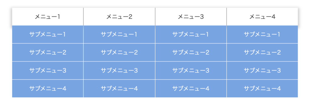
この段階では一旦全てのサブメニューが表示されているかと思います。
初期状態は非表示なので、その記述をしましょう。
.SubMenu {
  visibility: hidden; /* 追加 */
  position: absolute;
  left: 0;
  top: 50px;
  width: 100%;
  background-color: #6ba6e7;
}
これで非表示になります。
動きをつける
それでは、マウスオーバー時にメニューが表示されるようにしましょう。以下の記述を追加します。
.Menu-Item:hover .SubMenu {
  visibility: visible;
}
「マウスオーバーした時」は:hoverという擬似クラスを使って表現することができます。この擬似クラスがついているセレクタのプロパティは、マウスオーバーした時のみ適用されます。
よって上記の記述は「.Menu-Itemがマウスオーバーされた時、.SubMenuを表示する」という意味になります。
これでドロップダウンメニューの最低限の動きが出来ました。

アニメーションをつける
最後にアニメーションをつけていきましょう。サブメニュー出現時にふわっと下がりながら表示をします。
.SubMenu {
  visibility: hidden;
  position: absolute;
  left: 0;
  top: 40px; /* 50pxから40pxに変更 */
  width: 100%;
  background-color: #6ba6e7;
}

.Menu-Item:hover .SubMenu {
  transition: all 0.3s; /* 追加 */
  visibility: visible;
  transform: translateY(10px); /* 追加 */
}
このように追記することで、hover時にtransitionが適用されふわっと下がるように動きます。hoverした時の方にtransitionを設定することで、hoverが解除されると共にtransitionが外れ、パッと戻ります。
戻りでもアニメーションさせたい時は.SubMenuの方にtransitionを追加しましょう。
細かい点ですが、この状態では親メニューの上に重なった状態でアニメーションしています。下から出てきた方が良いので、ラベル部分が上に重なるように変更します。
.Menu-Item-Label {
  position: relative; /* 追加 */
  z-index: 10; /* 追加 */
  width: 100%;
  height: 50px;
  padding-top: 16px;
  padding-bottom: 16px;
  display: flex;
  justify-content: center;
  align-items: center;
  background-color: #fff;
  color: #333;
}
これでドロップダウンメニューの完成です!
まとめ
ということでドロップダウンメニューの作り方をなるべく細かく解説しました。
他にもいろんなパーツの解説をしていますので、ぜひご覧ください。
コメント